If you’re like me you have a list of favorites or retweets on Twitter a mile long. I use those two buttons interchangeably as a way to remind myself that I want to come back to the content and give it much more attention then a passing glance. Occasionally this backfires then I am stuck never returning to something I originally was curious about.
Luckily a couple days ago I saw an article from Bloomberg titled ‘How 24,000 Tweets Tell You What the Democratic Presidential Candidates Care About’ and was able to take my time. This brilliantly written and expertly presented article looks at topics of 2020 Democratic Presidential candidates to see where their focus lies. Please give it a read because it is much more insightful and interesting than this little tutorial. In this piece there are a couple of striking visualizations (which always get me). One is a streamgraph detailing the mention of topics since January 1st which is interesting but the second, a stacked bar chart of topics by candidate really resonated with me.
I relish every opportunity to use the rtweet package so I wanted to see if I could try my hand at a quick and dirty version of the original. So to start we need a few packages, then we can get right into the tweets thanks to the awesome work Mike Kearney has done with the rtweet package.
Really the only think we need is a list of the candidates to get started. Here I utilize a list of presidential candidates from the official TwitterGov account. Then it is just a matter of getting their timelines.
library(tidyverse)
library(rtweet)
library(fuzzyjoin) #to hastily match topics
library(awtools)
library(extrafont)

candidates<- lists_members(slug = 'presidential-candidates', owner_user = 'TwitterGov') %>%
  top_n(10,followers_count)

#coool now let's get those tweets
tweets<-get_timelines(candidates$user_id, n=1500, include_rts= FALSE)
Once we have the candidate tweets we then need to be able to categorize the tweets by topic. Since the Bloomberg article does not make their keyword/topic data available I found a CNN page, 2020 Election Coverage, with topics and election coverage and loosely based some topics on that article along with other keywords I have seen lately. I am sure there is better topic/keyword data that you don’t have to do manually but in the interest of time this is what I came up with.
#keyword stuff loosely based on CNN Politics: https://www.cnn.com/specials/politics/2020-election-coverage
topics<-data.frame(topic=c('Immigration border immigrants',
'Students education debt',
'Foreign policy peace',
'Climate change emissions',
'Economy taxes tariffs',
'Criminal justice crime',
'Election democracy politics',
'Veterans troops war',
'Jobs employment wage',
'Drug opioid epidemic',
'Health insurance medicare',
'Reproductive rights abortion',
'Green New Deal',
'Gun control violence'),stringsAsFactors = FALSE) %>%
  mutate(keys=strsplit(tolower(topic),' ')) %>%
  group_by(topic) %>%
  separate_rows()
Now that we have topics and keywords we can use this data to join the topics to tweets. This could be done a ton of different ways but because I wanted to get to the end result as quickly as possible I decided to go for a little fuzzy_join.
#clean and get topics
tweet.topics <- tweets %>%
  select(2:6) %>%
  regex_inner_join(.,topics,by = c('text'='keys'))

#summarize and get candidate info
candidate.topics <- tweet.topics %>%
  group_by(screen_name,topic) %>%
  summarize(n = n_distinct(status_id)) %>%
  left_join(.,select(candidates,screen_name,name))
Now time for the main event, creating the chart. I added a larger palette to awtools called ‘b_scale_fill(color)’ to accomodate a situation like this where there are more categories and I do not necessarily want to use the ggplot default.
ggplot(candidate.topics,aes(x = gsub(' ','\n', name), y = n, fill = topic)) +
geom_bar(position = 'fill', stat = 'identity') +
b_scale_fill() +
scale_x_discrete(position = "top") +
a_concert_theme(plot_title_size = 28,
grid = FALSE) +
theme(axis.title.y = element_blank(),
axis.text.y = element_blank(),
axis.ticks.y = element_blank(),
legend.position = 'bottom',
legend.direction = 'horizontal',
plot.title = element_text(hjust = 0.5),
plot.subtitle = element_text(hjust = 0.5)) +
labs(x=NULL,
fill=NULL,
title="Look Who's Tweeting",
subtitle='A look at tweet topics from the top ten 2020 candidates for President by follower count.')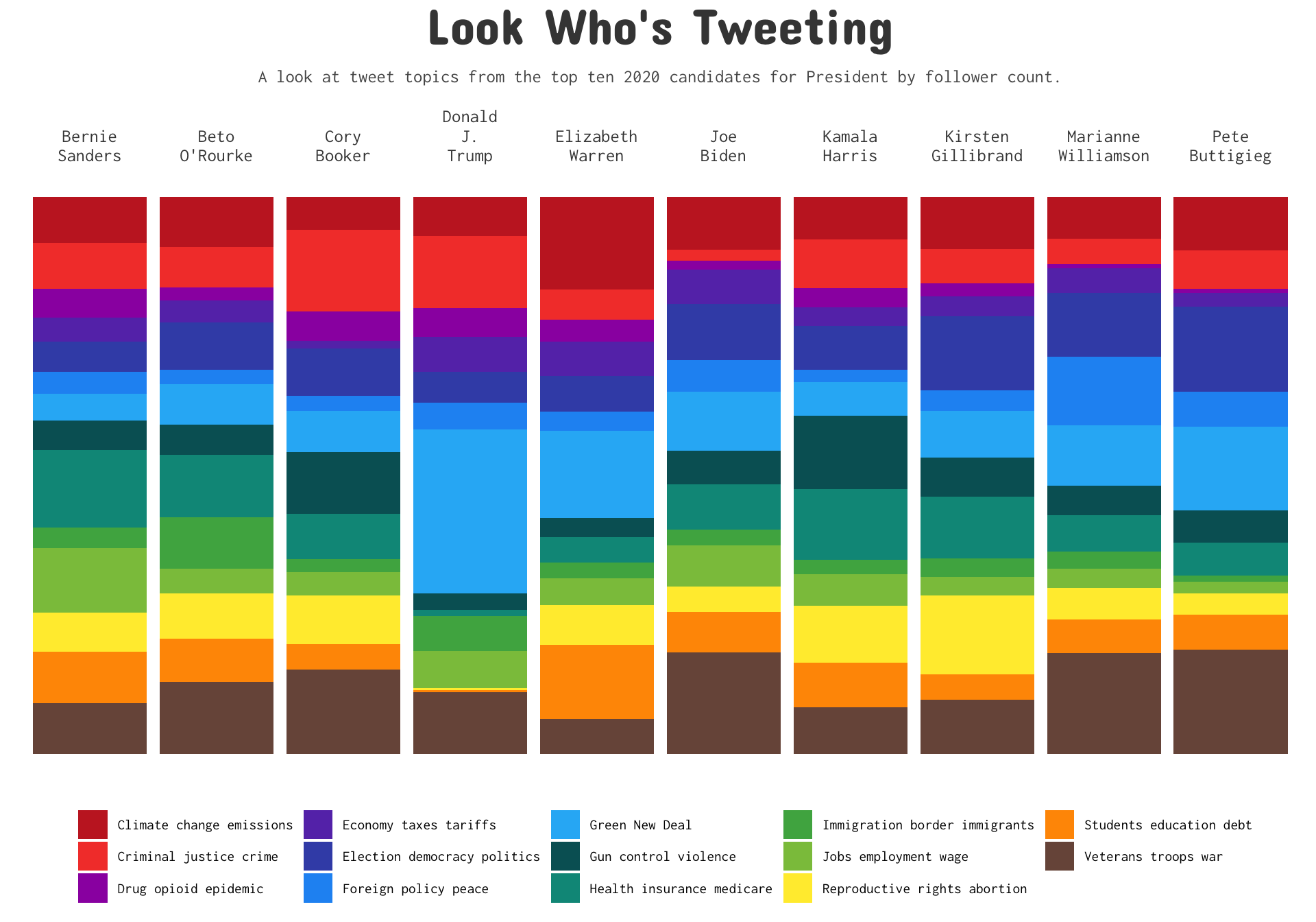 This is by no means perfect since some of the ‘topics’ can cross over. Take for example ‘debt’ could refer to the country’s economic debt or (possibly more likely) refer student debt which is a hot topic currently. I think overall this is an interesting way to take a look at candidates. Elizabeth Warren has specific plans for student debt and corporate taxes so it makes sense that she would be someone who is tweeting most about those topics.
To wrap it up I have to say I had fun and learned a lot about the candidates through interacting with their tweets. Engaging content like this is why I favorite/retweet things to go back to, if only I had the time to explore the data like I had for this one. Thanks for taking a look.