Premier League 2021-2022

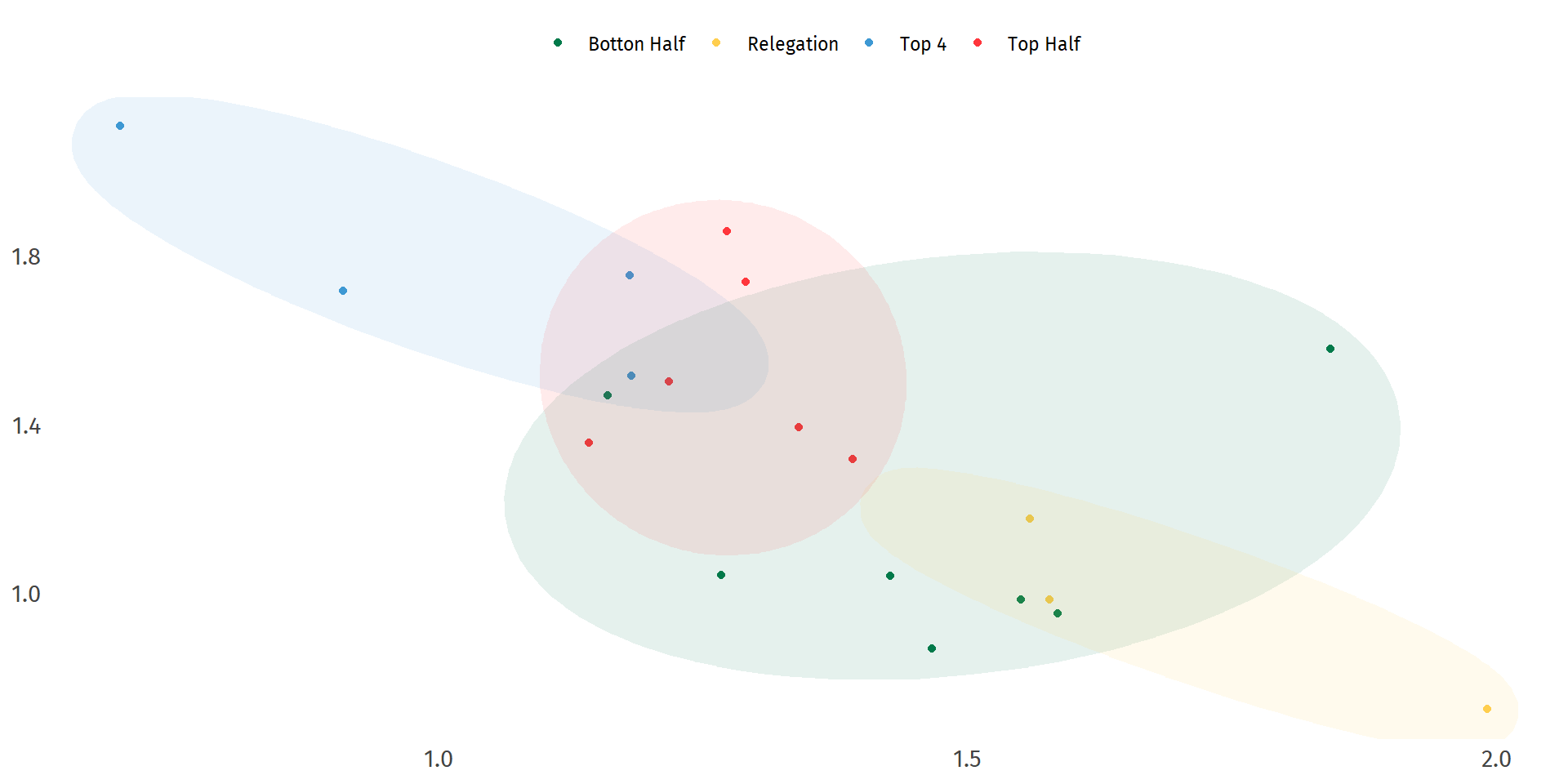
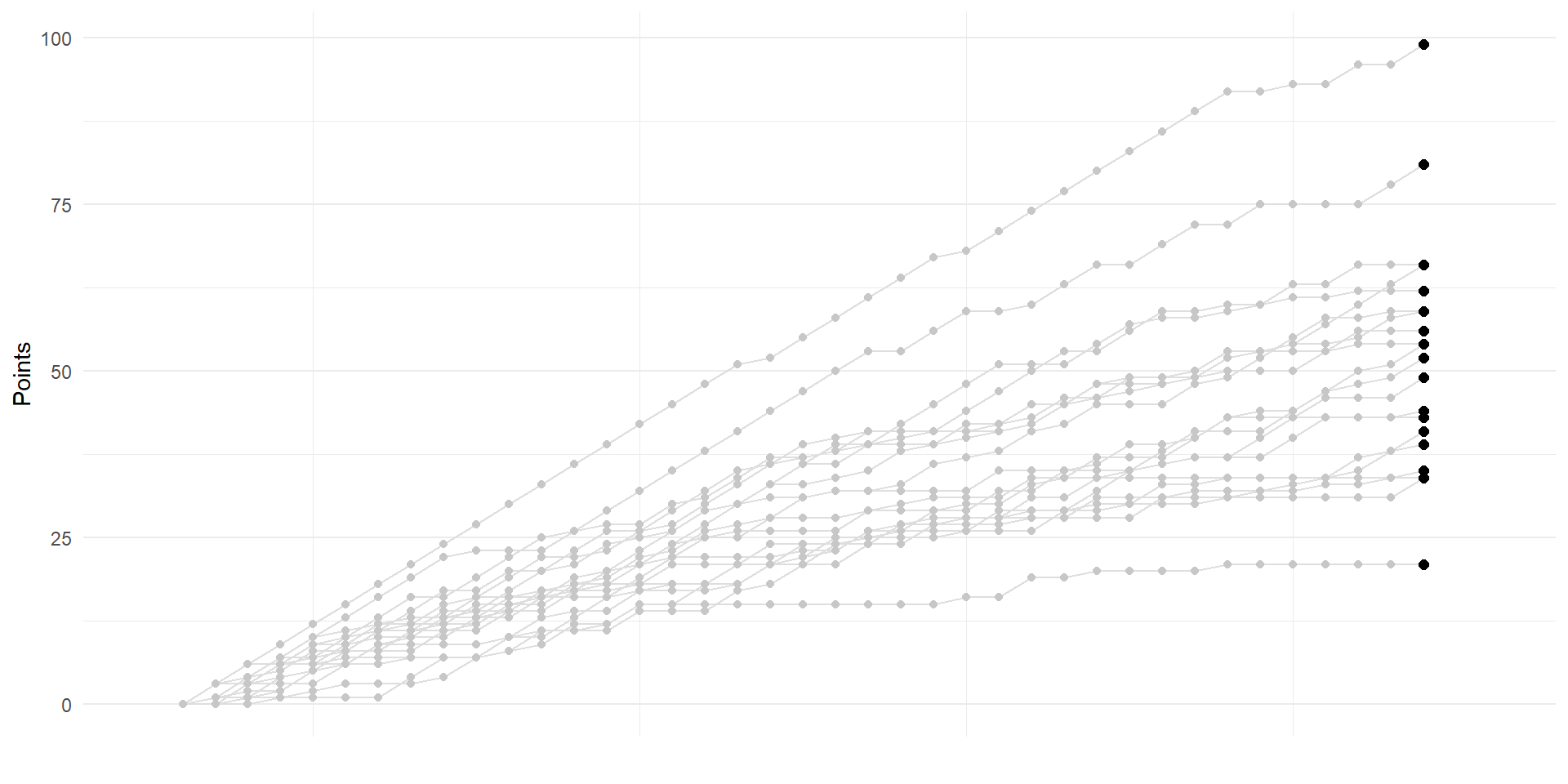
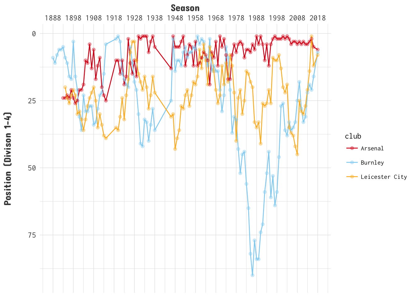
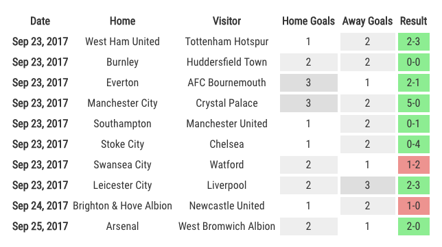
This is a page dedicated to weekly standings for the English Premier League. I am a fan of the Premier League and I am a long time Gooner though try as I might no sort of predictions I do can make them better. The first year was the 2017-18 season for which I did weekly predictions and ended up with 61% accuracy at the end of the year. The second year I got more ambitious and extended the model to include Transfer Market data, and ultimately only made it through 31 weeks.


If you are exposed to any media or news coverage around this season of the Premier League you will undoubtedly hear the term ‘xG’ or expected goals. Pundits use it, some announcers laugh at it and it is everywhere on Twitter or Reddit when it comes to discussing the outcome of games so what is it? Many people who are more eloquent than me have written about it so I will let you do the research on that and here are a couple links to help!


One of the most common questions I get in the comments here or on Twitter is about the making of the Title Race visual I use on my English Premier League (EPL) page here on the website. Normally I like to show all of my work in every boring detail when it comes to R but there were a few reasons that I had not put something together detailing my steps.


Watching the Premier League this year has been full of ups and downs (especially for an Arsenal fan) where one week is packed full of goals and the next is a true nil-nil bore. During these types of games or just any general down time I find myself diving into some of the history behind the teams I am watching or listening to some football podcasts.


Upon reading the news of the recent guilty plea and settlement by Purdue for $8billion this story thrust a news story that I had unfortunately lost touch with back into the spotlight. The opioid epidemic. A story that for some parts of 2017 and 2018 was front and center of the American news cycle had seemingly all but completely dropped away until this settlement news came out.


One consistent thread about this 2020 season of the Premier league that is woven through most of what I hear or read around it is that this season is mad. Mad results and mad goals. Frankly I agree and one couldn’t be surprised to feel this way when watching results like Aston Villa beating Liverpool 7-2. But the second piece about the ‘mad’ (read lots of) goals is something that I also believed especially when, while writing this, the first 0-0 draw of the season just happened.


There are so many helpful guides out there that detail creating your our ggplot2 theme but from my experience there is a disconnect between the very useful (and detailed) getting started type tutorials and the one-off very specific (but no less detailed) extending tutorials. I work at an intersection with quite a few folks who have to create or maintain visualizations for lots of different and ever changing clients so I thought it would be interesting to detail a way I believe one could easily get up and running with custom themes.


In this time of the pandemic I feel completely overwhelmed by the information available via the news, on the internet or thrown at me in lots of different conversations. Trying to take in every single piece of data and contextualize it quickly became impossible especially that when you couple it with work. Originally I felt compelled to try my hand at mapping spreads, infection rates and various other pieces but immediately felt out of my depth in subject matter and took to spreading the high quality information from those that were experts.


What Should I Watch?

Another entry in the series intended to help both you and me spend our time I put together this ‘app’ where it randomly selects a movie from the list of movies on Wikipedia that have won Academy Awards. How To: library(shiny) library(shinyWidgets) library(tidyverse) library(rvest) library(extrafont) #Data saved locally but can be acquired from the Wikipedia site wiki<-readRDS('wiki.rds') #UI with Styling ui <- fluidPage( tags$head( tags$style(HTML(" @import url('//fonts.googleapis.com/css?family=Inconsolata|Merriweather'); h1 { font-family: 'Merriweather', cursive; font-weight: 700; line-height: 1.


Seltzer: a drink app

Seltzer is a Shiny app built to leverage The Cocktail DB to help you find cocktails to make with ingredients you have.


For the past couple years now I have been participating and comissioning numerous Fantasy Premier Leagues. These leagues have often manifested across multiple sites like Fantrax or the Fantasy Premier League and they all tend to have different ways of suggesting what players a user should pick for their team. Most present last year’s stats, this year’s or average points per game week but these are all summary stats which got me thinking.


This Premier League season has been one of the most debated, scrutinized, and otherwise talked about seasons I can remember. Though the introduction of VAR (video assistant referee) and Liverpool’s currently unprecedented pace at the top of the league have been a lot of it I also hear and read a lot about the dominance of the Big Six and decided to take a look at whether that trend is continuing.


Awhile ago I wrote about trying my hand at creating a data visualization inspired by the The Pudding. I decided to do another one of those posts but this time inspired by a Flowing Data visualization looking at 2018 salary estimates from the Bureau of Labor Statistics. I stumbled upon this one on Twitter and thought I bet we can make something with ggplot2 and plotly.


If you were like me you spent this last Tuesday (10/15) sad, scared, and a little bit frustrated at how poorly the U.S. Men’s National Team (USMNT) were performing against our rivals to the North, Canada. Now I am being hyperbolic about a couple of those emotions but I really was quite frustrated at our seemingly backwards progress. Roger Bennett, of the Men In Blazers, eloquently tweeted this. US Men's Soccer Team just lost 2-0 to Canada.


Since rebranding this website from an undergraduate thesis project to what it is now I have wrote about a number of r packages that I really enjoy. One of them I keep coming back to for work and for this little hobby is tidycensus by Kyle Walker. As luck would have it I came upon a story on Twitter that gave me a chance to use tidycensus again but also create a map!


If you’re like me you have a list of favorites or retweets on Twitter a mile long. I use those two buttons interchangeably as a way to remind myself that I want to come back to the content and give it much more attention then a passing glance. Occasionally this backfires then I am stuck never returning to something I originally was curious about. Luckily a couple days ago I saw an article from Bloomberg titled ‘How 24,000 Tweets Tell You What the Democratic Presidential Candidates Care About’ and was able to take my time.


I spend a lot of time sifting through articles shared on Twitter trying to break up the monotony of the commute with fascinating stories, interesting research or compelling data visualizations. Few websites are more intriguing to me then The Pudding. Their combination of in-depth articles, stories, and fantastic data visualizations makes each piece a must-read. The Pudding is known for some amazing scrolly-telling pieces and this past week I came upon one such story: What makes a titletown?


On this website I use awtools which is a light (read not fully built) aesthetics package for all the charts and visuals. Every once in awhile I like to make tweaks so I thought I could take a minute to display some of the edits I made. Most the changes are to the color palettes, but there are a few spacing edits as well as tweaks to dark theme so why not makes a few charts.


Every once in awhile the internet gifts me a little inspiration rather than the normal disappointment. I have done a few posts in the past based on inspiration from around the web like this one on confederate monuments or this one looking at temperature trends with the ggridges package. This time as I was browsing Twitter I found this tweet by The Economist: Democracy is in decline in Turkey and Russia.


It is not often that I write about work on here. Usually it is a proving ground of concepts that I am usually trying to integrate into my work and I need to try them out. I decided to change that a little and write a tutorial on something I have found extremely useful in my work as a data scientist for nonprofits. Traditionally, being that the data we deal with is so highly sensitive, it is impossible to really share work or visualizations that are not macro-level so online tutorials for things involving nonprofits usually need some sort of scrubbed or anonymized data.


During the World Cup I did a write-up of FiveThirtyEight SPI rankings and estimated team market value to see where each team fell. The idea was identifying those teams who seem to be performing higher than their team value would suggest. I decided that for a quick little post I would explore that same concept but now since club season has started I can look at the English Premier League.


I was chatting with a friend recently about where we were from. He, being from the west coast talked about how the weather was almost always pleasant. I, being from Nebraska, lived about as far as possible from that sort of weather pattern. The summers were scorching and humid which gave way quickly to winters that were windy and terribly cold. This conversation led us to a 538 article we both read about places with the most unpredictable weather which got me thinking about how one could visualize these weather patterns.


I, like many of you I am sure, spend most of my time during the day on around or in front of the screen. Every once in awhile I come across an intriguing chart, a compelling article, or some very data that I want to inspect for myself. I have done a few of these in different iterations like a couple of my recent posts, A look into U.S. infectious diseases and Friday Fun: Comparing annual ACS data with tidycensus.


The Premier League just ended and normally this time of year is just spent reading up on transfer news until the league starts again, but not this year! It is a World Cup year which means that as of today the (real) biggest sporting event in the world kicks off. Some of you may know I (sort of) kept up my English Premier League predictions and while I am not doing the same for this World Cup I do have my own picks.


During the week I come across different articles, stories, posts even tweets that inspire or intrigue me and they end up in a list of things for me to revisit. Usually the subject is something that I know very little about but I want to. This week was no exception. I stumbled on an article from FiveThirtyEight titled More Americans Are Dying From Suicide, Drug Use And Diarrhea and was intrigued.


At the time of writing this I have been mired in one of life’s most confusing and convoluted processes, buying a house. After constantly being fed numbers, stats, and figures all of which had Comic Sans as a font, I decided to find out some information for myself. Doing that greatly helped inform me about the buying process and actually empowered me to speak to the various powers at be (and there are a lot of them) with a little more knowledge.


This season of the English Premier League has been nothing short of fantastic. Even though Manchester City has run away with the title (playing beautiful football in the process) pretty much all the other positions in the table are up for grabs. As an ardent Arsenal fan it hasn’t been my favorite season with Arsenal currently sitting in sixth but for other clubs it has been a banner year.


If you were like me Batman cartoons, movies and television shows had been a staple of your Saturday morning for years. They all started with the ‘Bat-man’ first appearing in comic books in 1939, and have come in many iterations from the dark and brooding to the fun and campy. Sadly the world recently lost the original Batman, Adam West, who starred in the 1960’s Batman TV series. I recently stumbled upon an article on Mental Floss that detailed the different villains from that series and decided to make a little tribute to that series and Adam West.


A good visualization always grabs my attention and draws me into articles. I am an avid follower of the Washington Post, New York Times, The Economist and a host of other websites/publications that are doing their fair share of data driven journalism. A couple weeks ago I came across a this article, Men, women, and films from 1843 Magazine which is the Economist’s lifestyle magazine. The article drew me in with the tagline “how pronounced is the gender divide on the silver screen”.


Before I begin I want to say that it is not my intention for this piece to be taken as political. This is more me looking into a dataset I kept coming across in the news cycle and found interesting. In the past few months a lot of things have captured the public eye’s focus and became blurry just as quick when something else happens. It is just the way news stories are covered now.


Recently I saw this really cool visualization around the reliance of the North Korean economy on trade from China. This tree_map is striking in a number of ways. One is that it conveys a ton of information in an easy on the eyes and interactive way. Another is the data itself. North Korea really does have quite the reliance on China. This got me thinking how I would visualize the information with R and I then came across a really cool example of how someone else visualized the same data via a sort of stream graph.


Heat maps with Divvy data 2

It is summer here in Chicago which means tourists abound and Divvy bikes are everywhere. Awhile ago, and a whole site ago, I posted a little how-to on making calendar heatmaps using the publicly available Divvy data. While that site is gone there are still some links to it out on the internet, one being the awesome Revolution Analytics blog, so instead of leaving people with a 404 I decided to revisit it.


Did you say eclipse?

I am not sure if you have heard about it yet but there will be a solar eclipse on 8/21/17. If you are one of a very few people who this is news to, congrats! As the day nears there have been a lot of articles and posts on the subject, with more than a few really awesome visualizations. The unique part about the eclipse is its path of totality that cuts through the heart of the United States.


Premier League 2017-2018

This is a page dedicated to weekly predictions for English Premier League. I am a fan of the Premier League and I support the Southampton Saints and am a long time Gooner though try as I might no sort of projection I do can make them better. A lot of the data for this comes from the awesome engsoccerdata package available on github. My predictions are under constantly construction, but they are based on Poisson distributions, and you can read a little bit about those here.


It brings me ggjoy

Awhile ago I posted about plotting the temperatures of Lincoln Nebraska that was inspired by a FiveThirtyEight article visualization. Well the internet have been abuzz with a new package found on github by Claus Wilke called ggjoy. So I decided to do a quick little post playing with it. Update! It is important to note that the ggjoy package has been deprecated and ggridges package should be the new default.


I guess what turned into one post about ACS data is now an installment series. The #rstats community is so productive with its output that as I finally figure out the extant of one package someone has made a streamlined, optimized, or shiny new one. Kyle Walker’s new tidycensus package is the latest in that long line and before you go any further I encourage you to follow the link to read his brief introductions.


Graph!? more like art Every once in a while, I run into an article with some data that really intrigues me, and sometimes I run into a data visualization that makes me think, “How can I do something like that?” Sometimes they both happen simultaneously and I have to drop everything to start working on it. That happened to me with the 538 article, The Most Conservative And Most Liberal Elite Law Schools.


UPDATE: I had mentioned that I did not believe ggplot2 was the right route for the four panel style presentation but see the R-Bloggers post on how to achieve it with ggplot2 and ggalt. It has been awhile since I have posted a tutorial, or anything for that matter, on my website so I decided to revisit some data from my old post. If you recall in that quick little visualization I just wanted to plot this great new data set.


Below is a tutorial that helps take ZIP code data and, with R, get rough latitude and longitude data from them as well as County. Then using ggplot2 we can create a nice visual of the data plotted at the county level. The first section was written as part of a larger project and I like to keep it around as it was one of the first tutorials on this website.