During the World Cup I did a write-up of FiveThirtyEight SPI rankings and estimated team market value to see where each team fell. The idea was identifying those teams who seem to be performing higher than their team value would suggest. I decided that for a quick little post I would explore that same concept but now since club season has started I can look at the English Premier League.
Getting the data
We will need data from a couple different places so let us start with that. We can scrape the league table from this very website. Then we will use the SPI ranking from FiveThirtyEight which you can read more about here and finally we can use the Transfer Markt estimated team market value that was used in the previous World Cup post.
library(tidyverse)
library(rvest)
library(waffle)
library(awtools) #optional: just for the graph aesthetics
#devtools::install_github('awhstin/awtools')
Once we have those loaded we can gather the data from the two sites and combine to get what we are interested in. If you want a very nice primer on working with the rvest package check out this tutorial over on the RStudio blog. All we need now is the CSS selector for the tables we need and then can import the data.
Now that we have those disparate datasets we can do a little work and bring them together.
#join data
squads <- squads %>%
  mutate(name = case_when(name == 'Brighton & Hove Albion' ~ 'Brighton and Hove Albion',
                          name == 'Newcastle United' ~ 'Newcastle',
                          name == 'Wolverhampton Wanderers' ~ 'Wolverhampton',
                          TRUE ~ name))

squad.rank <- inner_join(squads,world.rank) %>%
  inner_join(.,epl.table) %>%
  left_join(.,teamcolors)
As you will notice we also manually added a color variable. My first idea is to look at where the teams fall when organized by their SPI rank and estimated Market Value. I imagine there are some interesting groups.
ggplot(squad.rank,aes(x=Market.Value,y=rank,color=color)) +
  geom_point(aes(size=Market.Value),show.legend=FALSE) +
  geom_label(aes(label=name,colour=color), family='IBM Plex Mono',size=3.5,vjust="inward",hjust="inward") +
  scale_colour_identity() +
  scale_x_continuous(labels = scales::comma)+
  a_plex_theme() +
  labs(
    x='Market Value (Euros)',
    y='SPI Rank',
    caption='Market Value and Team data from Transfer Markt\nSPI ranking from FiveThirtyEight')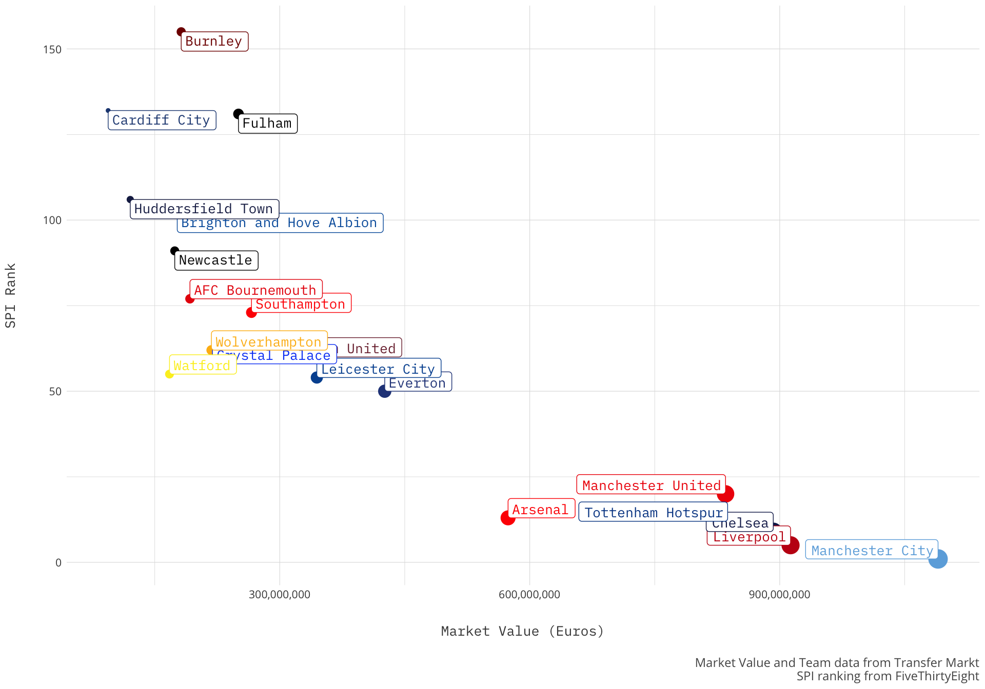
There is a clear group, usually referred to as the big 6, of Manchester City, Liverpool, Chelsea, Tottenham, Manchester United and Arsenal that have both a high market value and a good SPI ranking. Followed by the meat of the Premier League that spans from Everton to Huddersfield with three teams sort of pulling up the rear. The plot does follow a trend but a couple teams seem to buck that trend. Fulham seems to have a lower SPI ranking than their market value suggests while Watford (and Arsenal for that matter) seem to have a higher SPI than their counterparts with higher market value.
This chart shows us how the rank of each team corresponds to the market value but another compelling view would be to look at how the team is performing at this point in the year in the league. Similar to my chart from the World Cup it could show what teams are essentially over-performing based on their value.
We already have the data so let’s do it.
ggplot(squad.rank,aes(x=reorder(name,-pos),y=Market.Value)) +
  geom_linerange(aes(ymin=0,ymax=Market.Value),color='#dcdcdc') +
  geom_point(aes(color=color), size = 2) +
  scale_color_identity() +
  scale_y_continuous(labels = scales::comma)+
  geom_text(aes(label=m.compress(Market.Value)),check_overlap = TRUE, family='Open Sans',colour='#444444', hjust=-.25,size=3) +
  coord_flip() +
  a_plex_theme(grid=FALSE) +
  labs(title='Doing more with less',
       subtitle='A look at Premier League teams by current table and estimated team value by Transfer Markt',
       x='Team (by current EPL position)',
       y='Market Value (Euros)',
       caption='Market Value and Team data from Transfer Markt\nSPI ranking from FiveThirtyEight')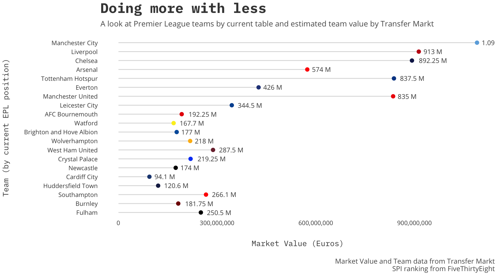
Interesting, Manchester United is a definite outlier, but it is intriguing to see AFC Bournemouth in the mix towards the top.
Derbies
Because last weekend was the NLD and Merseyside I decided to look at the history of a couple derbies as well. It was in the morning so naturally a waffle plot resonated with me. Using the engsoccerdata package we can get the data for the Manchester, Merseyside and North London derbies.
eng<-read_csv('https://raw.githubusercontent.com/jalapic/engsoccerdata/master/data-raw/england.csv')

manchester <- eng %>%
  filter((home == "Manchester United" & visitor == 'Manchester City')| (visitor == "Manchester United" & home == 'Manchester City')) %>%
  mutate(derby='manchester') %>%
  gather(team,club,4:5) %>%
  mutate(win=ifelse(team=='home' & result =='H','win',
                    ifelse(team=='visitor' & result =='A','win',ifelse(result=='D','draw','loss'))))

merseyside <- eng %>%
  filter((home == "Everton" & visitor == 'Liverpool')| (visitor == "Everton" & home == 'Liverpool'))%>%
  mutate(derby='merseyside')%>%
  gather(team,club,4:5) %>%
  mutate(win=ifelse(team=='home' & result =='H','win',
                    ifelse(team=='visitor' & result =='A','win',ifelse(result=='D','draw','loss'))))

nld <- eng %>%
  filter((home == "Arsenal" & visitor == 'Tottenham Hotspur')| (visitor == "Arsenal" & home == 'Tottenham Hotspur'))%>%
  mutate(derby='north london') %>%
  gather(team,club,4:5) %>%
  mutate(win=ifelse(team=='home' & result =='H','win',
                    ifelse(team=='visitor' & result =='A','win',ifelse(result=='D','draw','loss'))))

derbies <- manchester %>%
  rbind(.,merseyside,nld) %>%
  group_by(derby,club,win) %>%
  summarise(wins = n()) %>%
  filter(win !='loss')

knitr::kable(derbies)| derby | club | win | wins |
|---|---|---|---|
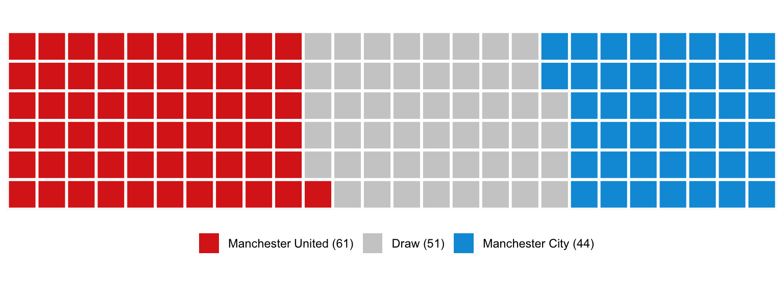
| manchester | Manchester City | draw | 51 |
| manchester | Manchester City | win | 44 |
| manchester | Manchester United | draw | 51 |
| manchester | Manchester United | win | 61 |
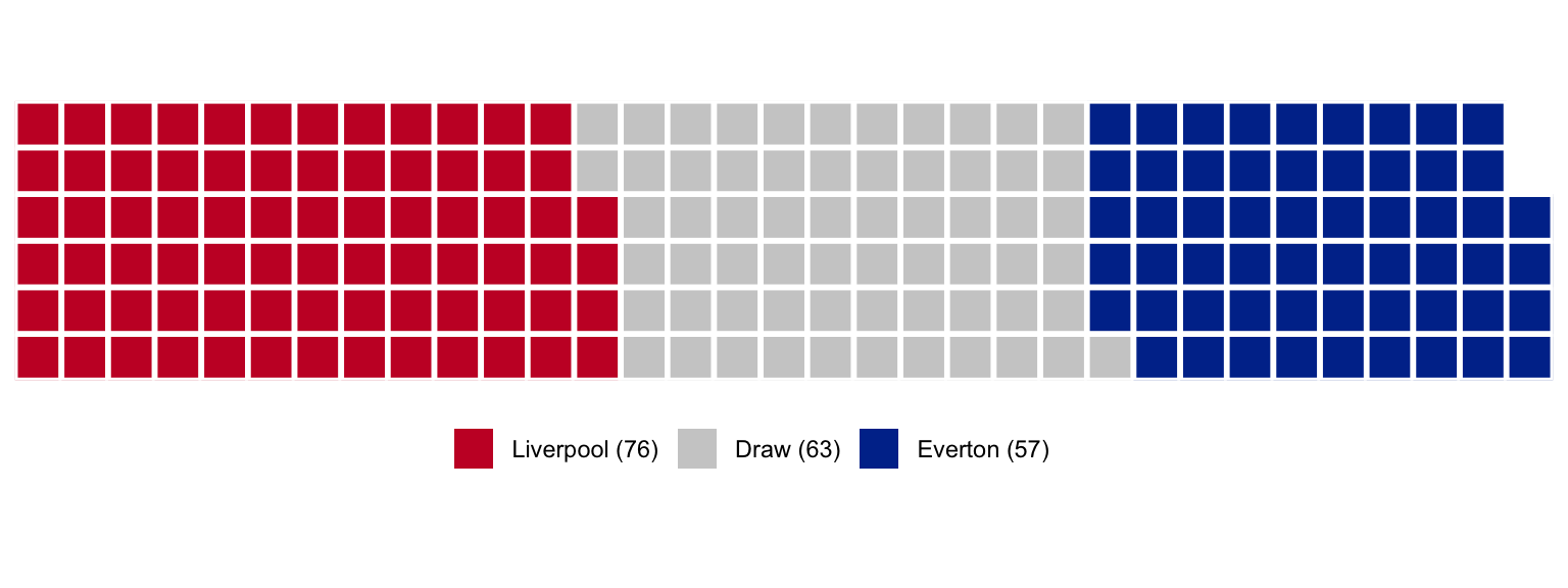
| merseyside | Everton | draw | 63 |
| merseyside | Everton | win | 57 |
| merseyside | Liverpool | draw | 63 |
| merseyside | Liverpool | win | 76 |
| north london | Arsenal | draw | 45 |
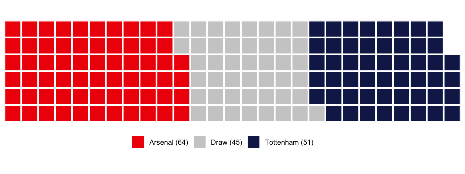
| north london | Arsenal | win | 64 |
| north london | Tottenham Hotspur | draw | 45 |
| north london | Tottenham Hotspur | win | 51 |
Now for waffles using the waffle package.
Manchester Derby
#waffle
man <- c(`Manchester United (61)` = 61, `Draw (51)` = 51, `Manchester City (44)` = 44)
waffle(
  man, rows = 6, size = 1,
  colors = c("#DA291C", "#cdcdcd", "#009bda"), legend_pos = "bottom"
)
Merseyside Derby
mer <- c(`Liverpool (76)` = 76, `Draw (63)` = 63, `Everton (57)` = 57)
waffle(
  mer, rows = 6, size = 1,
  colors = c("#c8102E", "#cdcdcd", "#003399"), legend_pos = "bottom"
)
North London Derby
nld <- c(`Arsenal (64)` = 64, `Draw (45)` = 45, `Tottenham (51)` = 51)
waffle(
  nld, rows = 6, size = 1,
  colors = c("#EF0107", "#cdcdcd", "#132257"), legend_pos = "bottom"
)