Before I begin I want to say that it is not my intention for this piece to be taken as political. This is more me looking into a dataset I kept coming across in the news cycle and found interesting.
In the past few months a lot of things have captured the public eye’s focus and became blurry just as quick when something else happens. It is just the way news stories are covered now. One story, more specifically one dataset, kept appearing for me which prompted me to find it and do my own exploration of it. I first came across this data, originally from the Southern Poverty Law Center, when FiveThirtyEight ran an interesting piece looking at the momentum groups were gaining for taking down some of these monuments. And of course there is this piece from Last Week Tonight that mixes a bit of comedy in with some facts. As always my preferred vehicle of exploration is R but some may notice that here a_theme is used, this is part of a very hodge-podge package I use for my website. A version of the package with most of the aesthetic aspects can be found here.
library(tidyverse)
library(statebins)
library(awtools) #just for the theme

confederate<-read_csv('https://raw.githubusercontent.com/awhstin/dataSet-List/master/confederate_symbols.csv')

#Washington Post
confederate.na<-subset(confederate,!is.na(year_dedicated))
confederate.na$year_dedicated<-as.numeric(confederate.na$year_dedicated)
confederate.na<-confederate.na%>%
  group_by(state)%>%
  mutate(counts=length(state))
look at the time(line)
It would benefit us to see a timeline of when each monument was dedicated by state. Awhile ago there was this thread on Twitter that discussed this visualization from the New York Times around the cost of national disasters. This visualization is one of the best examples of conveying a large amount of information in a very aesthetically pleasing way. I, along with others it seems, spent a bit of time trying to come up with other ways to represent this data and I certainly could not match the original. So calling to that New York Times chart as inspiration we can try and plot the timeline of confederate dedications for the state of Virigina.
va<-subset(confederate.na,state=='VA')
ggplot(va,aes(x=year_dedicated,y=reorder(state,counts),color=group_class))+
geom_count(alpha=.35,show.legend = F)+
a_theme(emphasis='x')+
a_scale_color()+
scale_x_continuous()+
labs(x='Year',
y='State')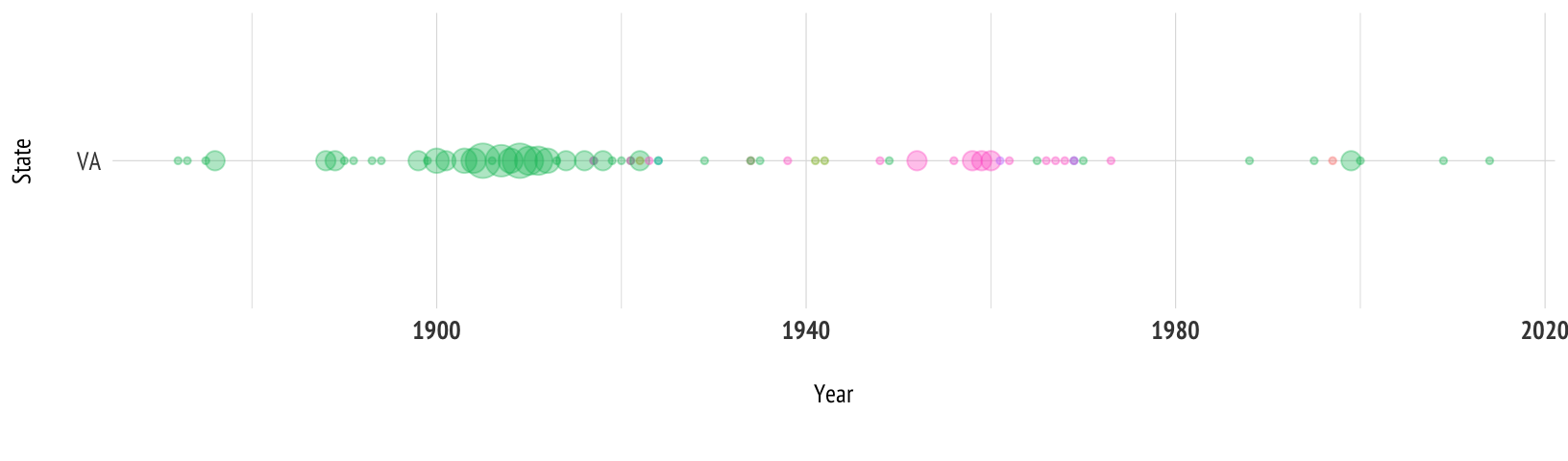 This gives us a detailed look into the spread of thsoe dedications over time, so now we just want to see how every state looks on the same timeline.
ggplot(confederate.na,aes(x=year_dedicated,y=reorder(state,counts),color=group_class))+
  geom_count(alpha=.35)+
  a_theme(emphasis='x')+
  theme(legend.position="top")+
  scale_x_continuous(position=c('top'))+
  labs(x='Year',
       y='State',
       title='When confederate monuments were dedicated',
       subtitle='A timeline of dedicated Confederate monuments by State with the most recent being dedicated in VA in 2014.\nMonuments with unknown years of dedication are omitted.',
       caption='Data: Southern Poverty Law Center')
a closer look
With this sort of visualization we can see some high-level trends. Like the big band of monuments dedicated in the early 1900’s. Then a higher concentration of schools dedicated just after 1950. To dive specifically into the types of different dedications it could be useful to look specifically at each category. Using the statebins package authored by Bob Rudis allows us to look at the distribution of specific categories across the states with a few lines.
states<-data.frame(state=state.abb,stringsAsFactors = F)
all.mon<-left_join(states,confederate)
all.mon[is.na(all.mon)]<-0
all.mon%>%
  group_by(state)%>%
  summarize(count=n()) %>%
  select(state=state, value=count) %>%
  statebins_continuous(legend_position="bottom", font_size=3, text_color='#ffffff',legend_title='count')+
  labs(subtitle=nrow(all.mon))+
a_theme(grid=F,noaxis=T)subset to filter on each category we are interested in.

Schools
143 total
Confederate school dedications are the third largest category in the dataset and have around 61% of the dedications with known dedication years. The earliest dedication of a school in the dataset is the dedication of Lee Elementary in 1910 located in Oklahoma. The latest dedication of a school is Robert E. Lee Primary Elementary School which was dedicated in 2012 and is located in Alabama.
Monuments
741 total
Monuments make up 47% of the data making it easily the largest category and with only 8% of those have unknown dedication dates makes it the most complete as well. The earliest dedication of a monument in the dataset is of the Confederate Flagpole which resides in Georgia and was dedicated in 1861. The latest monument dedication in the dataset is of The Heights at Smith Run which is located in Virginia and was dedicated in 2014.
Roads / Highways
513 total
The dedication dates of most of the highways and roadways in the dataset are unknown with over 98% unknown. Though there are some with speculated dates those of the dates that are known span from 1914 to 1957. The earliest dedication in the dataset is the dedication of Confederate Drive located in Missouri and was dedicated in 1914. The latest highway or roadway is Hood Avenue located in Georgia and was dedicated in 1957.
Counties
96 total
There is a precipitous drop off in number of dedications after monuments and highways/roadways with counties being the fourth largest category but only comprising 4% of the overall data. The earliest known county dedication in the dataset is of Bradford County which is a county in Florida that was dedicated in 1861. The latest known county dedication in the dataset is of Bleckley County which is located in Georgia and was dedicated in 1985.