I was chatting with a friend recently about where we were from. He, being from the west coast talked about how the weather was almost always pleasant. I, being from Nebraska, lived about as far as possible from that sort of weather pattern. The summers were scorching and humid which gave way quickly to winters that were windy and terribly cold. This conversation led us to a 538 article we both read about places with the most unpredictable weather which got me thinking about how one could visualize these weather patterns.
Recently at work I have been looking at some NCDC climate data and thought that a refresh of one of my favorite posts would be something. Awhile ago when the ggridges was released I posted a little tutorial using that package to look at annual temperature trends. It has been a little while and now that I live in Chicago it is time for a refresh. I think that the previous post showed an interesting look at how the temperature changes by month/year but I think this technique could also be used to emphasize that temperature variability we originally discussed.
Getting the data
The data is from the NCDC and their website is super helpful. You can pull tons of data and even search based on cities, ZIP, or station. Since I live north of the city I decided to use the data available from the O’Hare International Airport station.
To make things easier for this post I created a github repo that has a subset of the data I have been working with on it.
library(tidyverse)
library(ggridges)
library(awtools)

#import from github removing a field that doesn't exist in current year
ohare15<-read_csv('https://raw.githubusercontent.com/awhstin/temperaturesv2/master/OHARE-NCDC-2015.csv') %>% select(-c(5))
ohare16<-read_csv('https://raw.githubusercontent.com/awhstin/temperaturesv2/master/OHARE-NCDC-2016.csv') %>% select(-c(5))
ohare17<-read_csv('https://raw.githubusercontent.com/awhstin/temperaturesv2/master/OHARE-NCDC-2017.csv') %>% select(-c(5))
ohare18<-read_csv('https://raw.githubusercontent.com/awhstin/temperaturesv2/master/OHARE-NCDC-2018.csv')
Now that all the data is loaded we can join everything together and fill in some gaps in the temperature data TAVG.
ohare<-ohare15 %>%
  union(.,ohare16) %>%
  union(.,ohare17) %>%
  union(.,ohare18) %>%
  mutate(year=format(DATE,'%Y'),
         month=factor(months(DATE), levels=rev(month.name)),
         TAVG=ifelse(is.na(TAVG),(TMAX+TMIN)/2,TAVG))
Now we can use the TAVG field along with geom_density_ridges from the ggridges package to visualize the average temperature from the O’Hare station by month and year since 2015. My idea is that if we plot multiple years of average temperatures a broader picture of the months and their ranges.
ggplot(ohare, aes(x=TAVG, y=month, fill=year)) +
  geom_density_ridges(scale=.9, color=NA) +
  a_plex_theme(grid=FALSE) +
  scale_fill_manual(values=c('#d6d6d6','#adadad','#707070','#333333')) +
  labs(title='Annual Temperature Variablity: O\'Hare',
       subtitle='Changes in temperature at O\'Hare Airport from January 1st 2015 to September 28 2018 ',
       caption='Data from the NCDC\nhttps://www.ncdc.noaa.gov/',
       x='Temperature (F)',
       y='Month')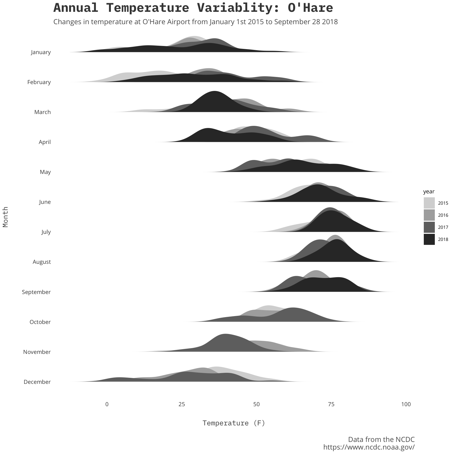
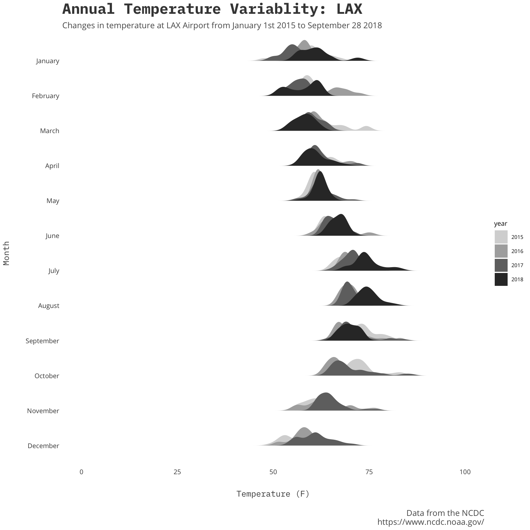
For some contrast let’s look at how temperatures at Los Angeles’ LAX shake out. I think that if the O’Hare temperatures emphasize the midwest’s temperature eccentricites then LAX temperatures should be consistent and offer a nice comparison. I didn’t have the data for this already so I used the NCDC website to pull a summary for the 2015-2018 so that is why this looks a little different.
lax<-read_csv('https://raw.githubusercontent.com/awhstin/temperaturesv2/master/LAX-NCDC-2015-18.csv') %>%
  mutate(year=format(DATE,'%Y'),
         month=factor(months(DATE), levels=rev(month.name)),
         TAVG=ifelse(is.na(TAVG),(TMAX+TMIN)/2,TAVG))
ggplot(lax, aes(x=TAVG, y=month, fill=year)) +
geom_density_ridges(scale=.9, color=NA) +
a_plex_theme(grid=FALSE) +
scale_fill_manual(values=c('#d6d6d6','#adadad','#707070','#333333')) +
labs(title='Annual Temperature Variablity: LAX',
subtitle='Changes in temperature at LAX Airport from January 1st 2015 to September 28 2018 ',
caption='Data from the NCDC\nhttps://www.ncdc.noaa.gov/',
x='Temperature (F)',
y='Month') +
scale_x_continuous(limits = c(0,100))