Awhile ago I posted about plotting the temperatures of Lincoln Nebraska that was inspired by a FiveThirtyEight article visualization. Well the internet have been abuzz with a new package found on github by Claus Wilke called ggjoy. So I decided to do a quick little post playing with it.
Update!
It is important to note that the
ggjoy package has been deprecated and ggridges package should be the new default. Please visit the introduction page if you have any specific questions. Below is a chart that references which functions have been renamed.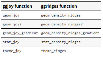
code
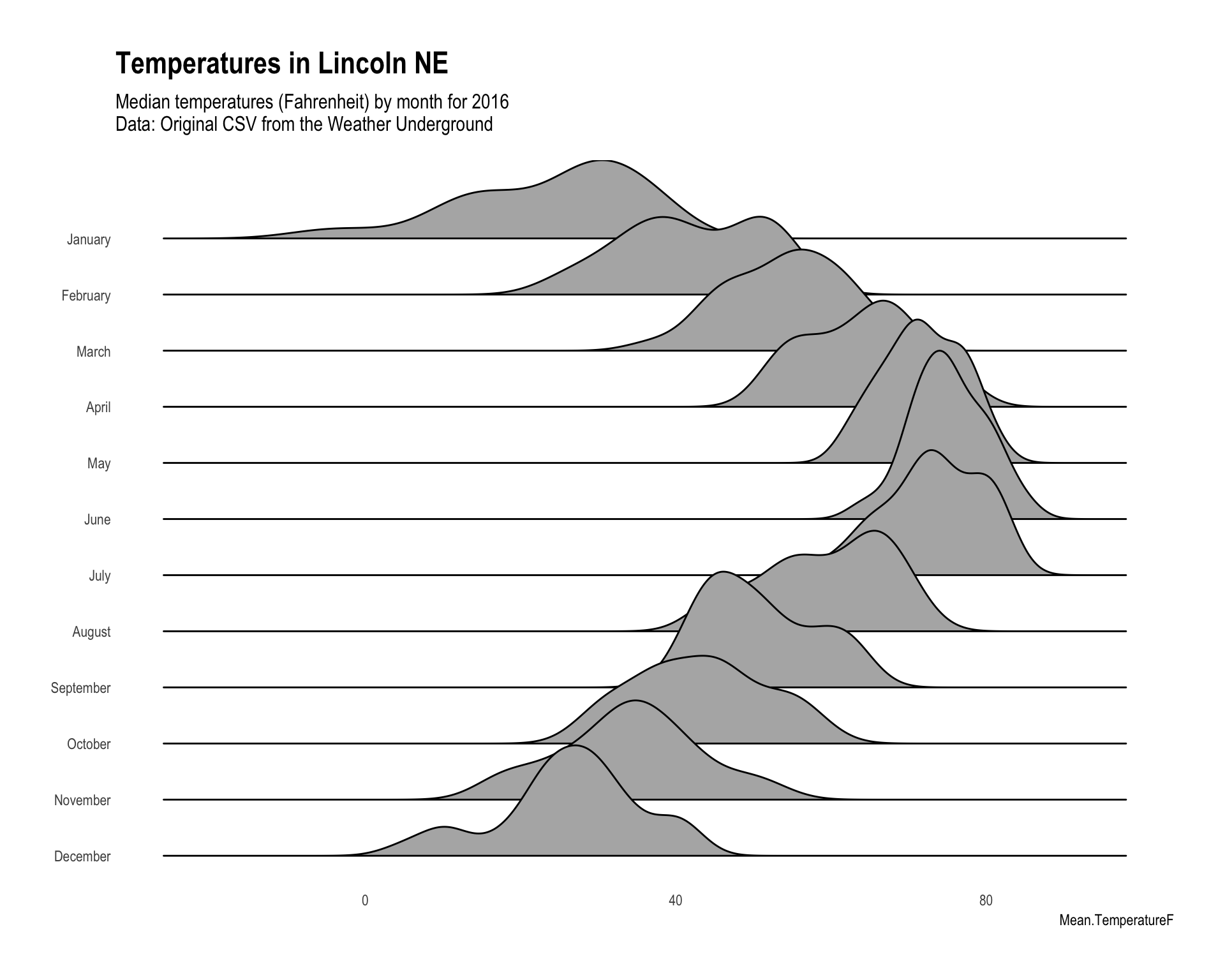
Once you have the package installed from github, go ahead and download this csv of the 2016 temperatures in Lincoln, NE. Then we can clean and format it to plot.
library(ggjoy)
library(hrbrthemes)
weather.raw$month<-months(as.Date(weather.raw$CST))
weather.raw$months<-factor(rev(weather.raw$month),levels=rev(unique(weather.raw$month)))

#scales
mins<-min(weather.raw$Min.TemperatureF)
maxs<-max(weather.raw$Max.TemperatureF)
To plot I decided to use the always sharp looking hrbrthemes::theme_ipsum and with a few lines we get a really nice looking joy plot. Which for the record is an awesome name, read this.
ggplot(weather.raw,aes(x = Mean.TemperatureF,y=months,height=..density..))+
     geom_joy(scale=3) +
      scale_x_continuous(limits = c(mins,maxs))+
  theme_ipsum(grid=F)+
  theme(axis.title.y=element_blank(),
        axis.ticks.y=element_blank(),
        strip.text.y = element_text(angle = 180, hjust = 1))+
  labs(title='Temperatures in Lincoln NE',
       subtitle='Median temperatures (Fahrenheit) by month for 2016\nData: Original CSV from the Weather Underground')