One of the most common questions I get in the comments here or on Twitter is about the making of the Title Race visual I use on my English Premier League (EPL) page here on the website. Normally I like to show all of my work in every boring detail when it comes to R but there were a few reasons that I had not put something together detailing my steps. The first was that I have not been convinced it is in its final form since I still struggle with the layout occasionally and the aesthetics are also something I go back and forth on. The second reason goes hand-in-hand with the first because since my waffling on pieces of it I have never really sat down to clean up the process of making it.
So here we are. I am using this small how-to piece to do the cleaning up I have neglected for awhile.
The key data for this, and most of my EPL related pieces, is the engsoccerdata which can be found here.
library(tidyverse)
library(awtools) #just for aesthetics
#devtools::install_github('jalapic/engsoccerdata')
library(engsoccerdata)
library(ggrepel)
Once we have all those loaded things are pretty straightforward. The idea first came to me when Manchester City was having their incredible season 2017-18 where they hit 100 points. I wanted a way to visualize the consistency of their play, along with emphasizing the gap they had over second place and the rest of the field. I have never really been one for animated (think racing bar chart etc) visualizations so I thought a simple dot and line plot might be a good starting place. To do that though I needed a weekly breakdown of the points amassed by team.
I will use the previous season data for this which will fetch all the games for the 2019 season. Once we have those I copy and paste a bit of code I have been using for awhile to create an equally handy dataframe of the team’s points by week. When that is created you could start building the chart but you would start really at the first result but in reality all teams start from 0. So before we assemble I want to create a dummy week so all the teams start from the same spot then it is as simple as assembling the pieces grouping by club and running a cumulative sum for the points.
#build points
current <- england %>%
  filter(Season == 2019 & division == 1) %>%
  gather(team, club, 3:4) %>%
  mutate(win = ifelse(team == 'home' & result == 'H', 3,
                    ifelse(team == 'visitor' & result == 'A', 3,
                           ifelse(result == 'D', 1, 0)))) %>%
  filter(division == 1) %>%
  mutate(week = lubridate::week(Date)) %>%
  select(12:14)

initial <- data.frame(
  club = unique(current$club),
  win = 0,
  week = 36
)

current_pts <- initial %>%
  bind_rows(., current) %>%
  group_by(club) %>%
  mutate(pts = cumsum(win),
         id = row_number())
The final pieces to the puzzle are things I found I needed after the fact. I originally plotted the current_pts dataframe and it was okay but creating these next few little pieces helped clean things up. I realized I wanted team colors for the labels and once those colors were in I realized the ordering was a lot less straightforward because of points and goal differential etc so I brought in the table data as well to make sure things were in the right order.
colors <- read.csv('https://raw.githubusercontent.com/awhstin/Dataset-List/master/teamcolors.csv', stringsAsFactors = FALSE) %>%
  rename(club = full)

x_limit <- max(current_pts$id)

table <- maketable_eng(df = england, Season = 2019, tier = 1) %>%
  rename(club=team)

#Assemble!
maxes <- current_pts %>%
  filter(id == max(id)) %>%
  left_join(.,colors) %>% #for the team colors
  left_join(.,table) %>% #for the special ordering
  mutate(Pos=as.numeric(Pos)) %>%
  arrange(-pts, Pos)
Bringing the pieces together
Finally. I build the base of the chart off of the current_pts data we assembled to show the path to the eventual place. Then expanding the x axis via the limit variable we just created to make room for the labels which using some trickery from ggrepel namely the hjust parameter the labels stack to the right. The color is added to the label and there it is.
ggplot(current_pts,aes(id, pts, group = club)) +
  geom_line(color = '#dedede') +
  geom_point(color = '#c7c7c7') +
  geom_point(data = maxes, aes(id, pts),show.legend = FALSE, size = 2) +
  geom_label_repel(data = maxes, aes(x = id, y = pts, label = club),
                            show.legend = FALSE,
                            size = 2,
                            fill = 'white',
                            color= maxes$color,
                            family = 'IBM Plex Mono',
                            nudge_x = 6,
                            direction = "y",
                            hjust = 1,
                            segment.size = .25,
                            segment.alpha = .5) +
  xlim(0,(x_limit+5)) +
  a_plex_theme(emphasis = 'y') +
  theme(axis.text.x = element_blank(),
        panel.grid.major.x = element_blank()) +
  labs(x = '',y = 'Points')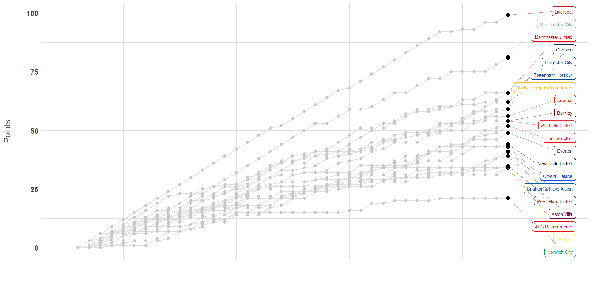
There we are! Hopefully this brief but somehow wordy walk through was helpful. Please feel free to drop me a line here or on Twitter if you have any questions or comments or if you have a different way of visualizing the title race. Thanks.