Since rebranding this website from an undergraduate thesis project to what it is now I have wrote about a number of r packages that I really enjoy. One of them I keep coming back to for work and for this little hobby is tidycensus by Kyle Walker. As luck would have it I came upon a story on Twitter that gave me a chance to use tidycensus again but also create a map! The article was about the income you needed to make in the largest U.S. cities to be able to afford a two bedroom apartment. This reminded me of a post I did awhile back looking at the percent of median household income that is taken up by housing costs so I decided to resurrect that old post and put a new twist on it!
library(albersusa) #for the projection
library(tidycensus) #data
library(awtools) #aesthetics
library(tidyverse)
library(viridis)
library(ggrepel)
Once we have those packages loaded (or installed) and once you have followed the instructions found here we can get started with gathering data from the ACS api. The two variables we will be using are: B19013_001 which is the median household income, and B25105_001 which is the median monthly housing cost.
options(tigris_use_cache = TRUE)
income<- get_acs(geography = "county", variables = "B19013_001")
## Getting data from the 2013-2017 5-year ACShc<- get_acs(geography = "county", variables = "B25105_001", geometry = TRUE)## Getting data from the 2013-2017 5-year ACShc$estimated<-hc$estimate*12
income$percent<-hc$estimated/income$estimate*100Once we have both of those and have calulcated our percents we need to prepare the map projection. Then join the map to the ACS data we gathered before. Before this happens I believe this is most likely an opportunity for improvement but in the interest of keeping this under an hour I decided to reuse code I have used before without really looking for better ways. If you have some suggestions feel free to drop them in the comments! Thanks.
cty_sf <- counties_sf("aeqd")
cty_sf$NAME<-paste0(as.character(cty_sf$name),' ',as.character(cty_sf$lsad),', ',as.character(cty_sf$state))
cty_income<-left_join(cty_sf,income,by='NAME')
I think it would be interesting to see where some of the highest percentages are so I want to isolate the top 25 areas by percent and use that data for the labels on our map.
#find the cities
hrdshp<- income %>%
  arrange(-percent) %>%
  slice(1:25) %>%
  inner_join(.,cty_sf) %>%
  mutate(
    label=paste0(name,', ',as.character(iso_3166_2))
  )
Now we can put it all together!
cty_income %>%
  ggplot(aes(fill = percent, color = percent)) +
  geom_sf() +
  geom_label_repel(data=hrdshp,
                aes(label=label, geometry=geometry),
                size=3,
                color='#222222',
                stat = "sf_coordinates") +
  scale_fill_viridis(option = "magma") +
  scale_color_viridis(option = "magma")+
  a_plex_theme(grid = FALSE) +
  theme(axis.title.x=element_blank(),
        axis.text.x=element_blank(),
        axis.title.y=element_blank(),
        axis.text.y=element_blank(),
        legend.position="bottom") +
  labs(title='Burden of roof',
       subtitle='The impact of housing costs on income. The percent value is calculated by dividing median household\nincome (B19013_001) by the median monthly housing costs (B25105_001) by county. The map\nshows the names of the top 25 counties by their percent.',
       caption='Data: tidycensus\nACS 2013-2017 5-year estimates')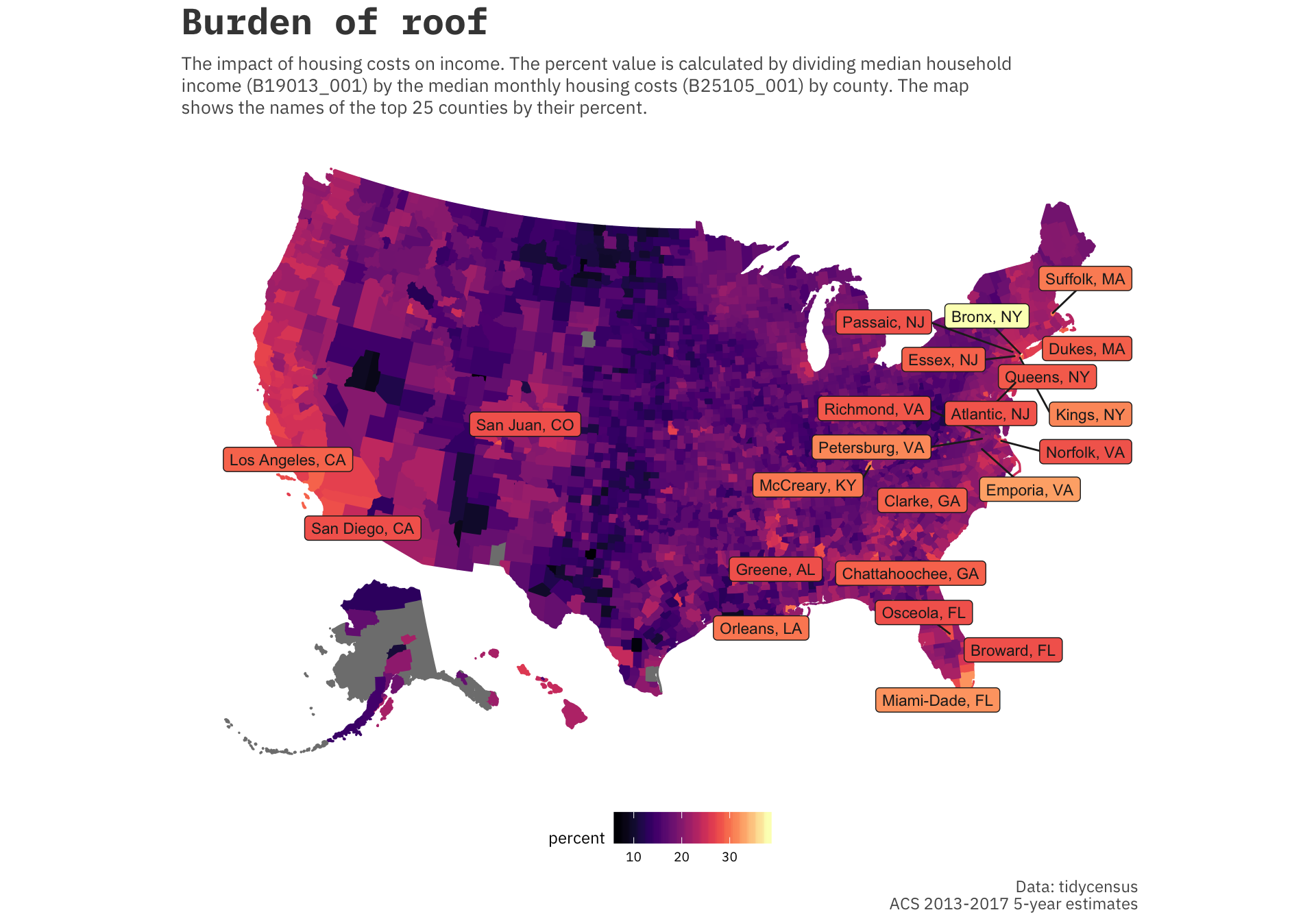
Clearly these counties are centered around some of the largest metropolitan areas that were mentioned in the article. Areas around Washington D.C., Los Angeles, New York City, Miami all have high housing costs as a percentage of the median household income. The original article mentions that the HUD (Department of Housing and Urban Development) describes housing a burden if it occupies more than 30% of your income.