This Premier League season has been one of the most debated, scrutinized, and otherwise talked about seasons I can remember. Though the introduction of VAR (video assistant referee) and Liverpool’s currently unprecedented pace at the top of the league have been a lot of it I also hear and read a lot about the dominance of the Big Six and decided to take a look at whether that trend is continuing. Surely their spending has outpaced a lot of the mid-bottom tier teams in the Premier League, but has their play? Since 2013 52% of expenditures in the Premier League were done by the Big Six (see spend data I collected here). Let’s take a look at what that has got them.
library(tidyverse)
library(engsoccerdata)
library(ggtern)
library(awtools)
library(plotly)

#load colors
team_colors <- read_csv('https://raw.githubusercontent.com/awhstin/Dataset-List/master/teamcolors.csv')
bigsix <- c('Arsenal','Chelsea','Liverpool','Manchester City','Manchester United','Tottenham Hotspur')
england<-read.csv('https://raw.githubusercontent.com/jalapic/engsoccerdata/master/data-raw/england.csv',stringsAsFactors = FALSE)

#data for last ten years
pl_data <- england %>%
  filter(division == 1 & Season %in% 2000:2018)

teams <- pl_data %>%
  gather(team,club,3:4) %>%
  mutate(goals=ifelse(team=='home',hgoal,
                    ifelse(team=='visitor',vgoal,0)),
         allowed=ifelse(team=='home',vgoal,
                      ifelse(team=='visitor',hgoal,0)),
         win=ifelse(team=='home' & result == 'H',3,
                    ifelse(team=='visitor' & result == 'A',3,
                           ifelse(result=='D',1,0))))
Once we have the data loaded we can start to answer some questions. I think to start off I am curious as to how the big six have performed with goal creation over the last several years. Why look at goals? From a team form perspective goals can indicate confidence, creativity and strength of the team. From a standings point of view you need to score goals to win games so the more goals scored the more likely the team is to be high in the tables. Since we are focusing on the big six we will use a collection of team colors I have assembled and highlight only the big six teams.
teams_year <- teams %>%
  group_by(club, Season) %>%
  summarize(goals=sum(goals)) %>%
  arrange(Season, -goals) %>%
  ungroup() %>%
  group_by(Season) %>%
  mutate(id=row_number()) %>%
  left_join(.,team_colors,by=c('club'='name')) %>%
  ungroup()


#'Big 6' contributions
bigsix_year <-  teams_year %>%
  mutate(group = ifelse(club %in% bigsix, color, '#999999'),
         rank = ifelse(club %in% bigsix,id,21))

ggplot(bigsix_year,aes(Season,goals,fill = reorder(group,-rank))) +
  geom_bar(stat='identity',position='fill',color='#888888') +
  scale_fill_identity() +
  scale_y_continuous(labels = scales::percent_format()) +
  a_plex_theme()+
  theme(plot.title = element_text(hjust = 0.5)) +
  labs(title='Goals by the Big 6 by season',
       x='',
       y='')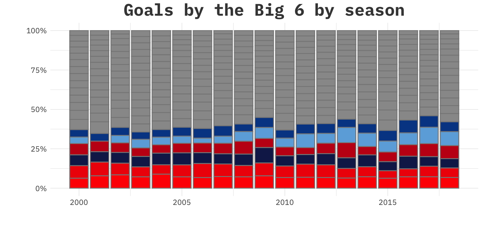
Well since the goals don’t necessarily indicate anything maybe we need to look elsewhere. It can be the case that though the big six are scoring lots of goals doesn’t mean they would be the highest on the table so maybe we will look solely at points. Points, unline goals, are finite. There are only so many matches in a season, and only one team can take all three points from each so it might be more indicative of a trend in dominance if the big six are taking more and more of the possible points.
#so not goals, maybe points?
teams_pts_year <- teams %>%
  group_by(club, Season) %>%
  summarize(pts=sum(win)) %>%
  arrange(Season, -pts) %>%
  ungroup() %>%
  group_by(Season) %>%
  mutate(id=row_number()) %>%
  left_join(.,team_colors,by=c('club'='name')) %>%
  ungroup()

#maybe big six?
b6_pts <- teams_pts_year %>%
  mutate(group = ifelse(club %in% bigsix, color, '#999999'),
         rank = ifelse(club %in% bigsix,id,21))

ggplot(b6_pts,aes(Season,pts,fill = reorder(group,-rank))) +
  geom_bar(stat='identity',position='fill',color='#888888') +
  scale_fill_identity() +
  scale_y_continuous(labels = scales::percent_format()) +
  a_plex_theme() +
  theme(plot.title = element_text(hjust = 0.5)) +
  labs(title='Percent of points won by the Big 6',
       x='',
       y='')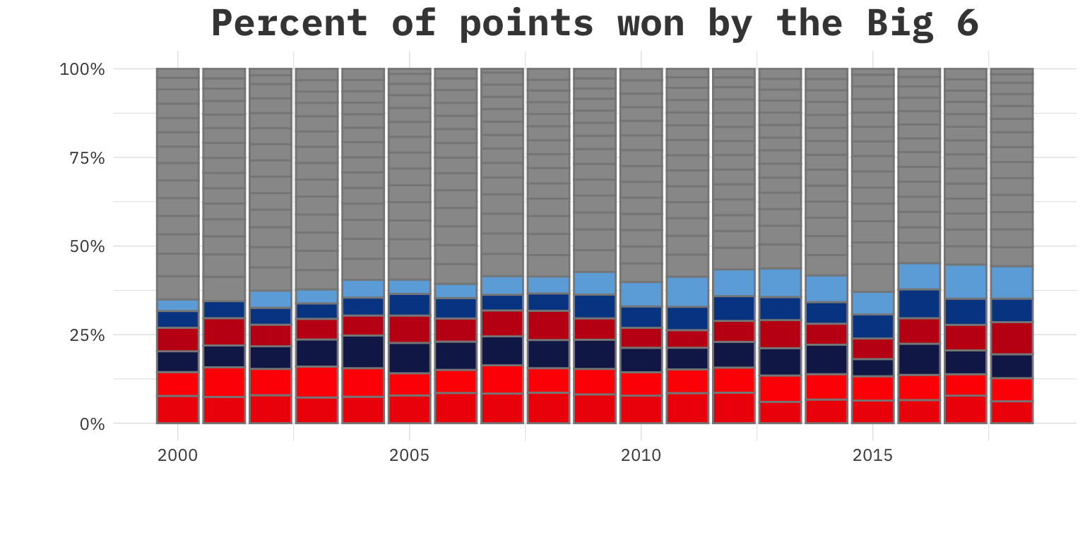
That is interesting. It does look like there is a slight upward trend of total points by year for the big six but I am not convinced as I am looking to find a way to isolate the big six from the rest of the pack. These last two plots are just showing how well they are doing against the other teams but possibly if we add a third piece that can get more at how the other teams fair againest these big six sides. Let’s add in goals allowed. I have always wanted to use ternary plots but haven’t really found a place that they would fit in so I thought why not try them here and luckily the ggtern package exists. So we can prep the data.
#What teams are most like the big 6 then?
tern_data <- teams %>%
 filter(Season >= 2010) %>%
  group_by(club, Season) %>%
  summarize(pts=sum(win),
            goals = sum(goals),
            allowed = sum(allowed)) %>%
  ungroup() %>%
  left_join(.,team_colors,by=c('club'='name')) %>%
  mutate(group = ifelse(club %in% bigsix, color, '#999999'))

tern_summary <- tern_data %>%
  group_by(club,group) %>%
  summarize(pts=mean(pts),
            goals=mean(goals),
            allowed=mean(allowed)) %>%
  ungroup() %>%
  mutate(size=((pts+goals)/allowed)*5,
         text=paste0(club,'<br>Avg. Points: %{a}<br>Avg. Goals: %{b}<br>Avg. Allowed: %{c}<br>'))

b6_tern<- tern_summary %>%
  filter(club %in% bigsix)
Now let’s plot using plotly to help make it interactive.
#plotly setup
axis <- function(title) {
  list(
    title = title,
    titlefont = list(
      size = 15
    ),
    tickfont = list(
      size = 0
    ),
    tickcolor = 'rgba(0,0,0,0)',
    ticklen = 5
  )
}


tern_summary %>%
  plot_ly() %>%
  add_trace(
    type = 'scatterternary',
    mode = 'markers',
    name='',
    a = ~pts,
    b = ~goals,
    c = ~allowed,
    hovertemplate = ~text,
    marker = list(
      symbol = 'circle-closed',
      size = ~size,
      color = ~group,
      line = list(color='white')
    )
  )%>%
  layout(
    ternary = list(
      sum = 100,
      aaxis = axis('Points'),
      baxis = axis('Goals'),
      caxis = axis('Allowed')
    )
  )
Big 6… maybe more like Big 9
A look at the average goals, points and goals allowed teams in the Premier League.
An important thing to note is that there is something special going on with how Everton, Southampton and Leicester have performed. This ternary plot is adding a third dimension to help separate the Big 6 out from the rest of the pack and what we see is that the other three have (historically) performed at around the same level in regards to these parameters. In Southampton’s case often at a far lower cost as well. The Big Six have been performing at a higher level than the rest of the field, maybe this historical Liverpool performance along with Manchester City’s record setting performance in the 2017 season is a sign they are pulling further away?