I guess what turned into one post about ACS data is now an installment series. The #rstats community is so productive with its output that as I finally figure out the extant of one package someone has made a streamlined, optimized, or shiny new one. Kyle Walker’s new tidycensus package is the latest in that long line and before you go any further I encourage you to follow the link to read his brief introductions.
I have posted a couple times about working with ACS data in R, mainly via the acs package. But a lot of the complications I ran into those first tutorials were with the data pull and format. The resulting pull from the API creates an acs object which to me are unwieldy at times, which is only one of many places where tidycensus excels.
Before you start please get your API Key for the Census Bureau Data API.
library(albersusa)
library(tidycensus)
library(tidyverse)
library(ggthemes) #just for theme_map()
library(viridis)
#census_api_key('yourkeyhere')
income<- get_acs(geography = "county", variables = "B19013_001", geometry = TRUE)
hc<- get_acs(geography = "county", variables = "B25105_001", geometry = TRUE)
hc$estimated<-hc$estimate*12
income$percent<-hc$estimated/income$estimate*100Simple at that! The resulting pull is already tidied and in an easy to use dataframe instead of the acs object. This saves loads of time and numerous lines of code. Here is where I deviate a little from Kyle’s tutorial and use the Albers projection from Bob Rudis’ albersusa package available on github. (I am sure there is a better way to do this than the merge I did, so if you have thoughts drop me a line!) The last line is where I rename the Albers projection geometry to ‘geometry’ (from geometry.x) because the ‘geom_sf’ looks for it.
#merge
cty_sf <- counties_sf("aeqd")
cty_sf$NAME<-paste0(cty_sf$name,' ',cty_sf$lsad,', ',cty_sf$state)
cty_income<-left_join(cty_sf,income,by=c('NAME'))
names(cty_income)[9]<-'geometry'
Finally we plot it using the ‘inferno’ or ‘B’ color palette from viridis to get the image below.
#plot
cty_income%>%
  ggplot(aes(fill = estimate, color = estimate)) +
  geom_sf() +
  scale_fill_viridis(option = "inferno") +
  scale_color_viridis(option = "inferno")+
  theme_map(base_size = 11,base_family = 'Roboto Condensed')+labs(title='Household Income by County',subtitle='Median household income from the 2011-2015 ACS')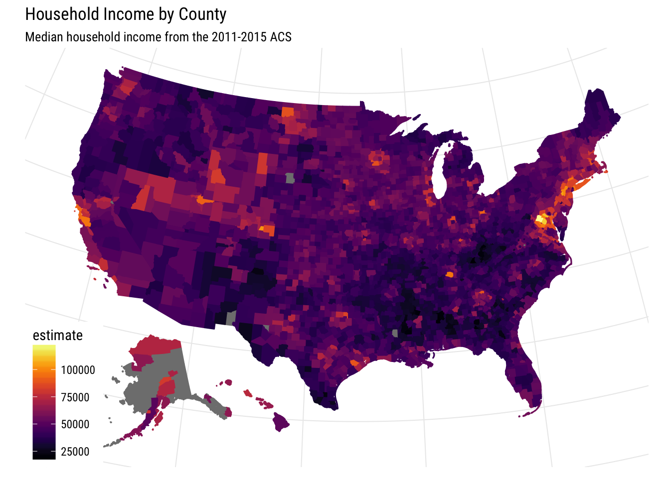
Interesting. It seems like some of the darkest areas correspond with big metropolitan areas. I think it would be more interesting though if we could compare that median household income to something else. Luckily all we have to do is make another pull, this time for table ‘B25105_001’, which corresponds to the median monthly housing costs. Then we just calculate the percent and plot it replacing just the ‘fill’ and ‘color’ elements.
cty_income%>%
  ggplot(aes(fill = percent, color = percent)) +
  geom_sf() +
  scale_fill_viridis(option = "inferno") +
  scale_color_viridis(option = "inferno")+
  theme_map(base_size = 11)+labs(title='Percent of Household Income Toward Housing Costs',subtitle='Median housing costs divided by median household income\nby county from the 2011-2015 ACS')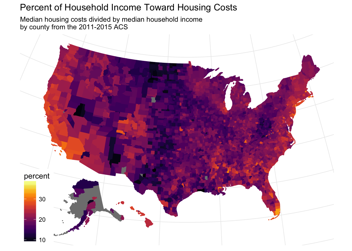
With both of these datasets we can start to get a better picture of how income is spread. Though this is an attempt at a very raw cost of living calculation I think it paints a more interesting picture. It seems that there is a pretty distinct band straight through the middle of the country, I guess you have to pay to live on the coast.