Recently I saw this really cool visualization around the reliance of the North Korean economy on trade from China.
This tree_map is striking in a number of ways. One is that it conveys a ton of information in an easy on the eyes and interactive way. Another is the data itself. North Korea really does have quite the reliance on China. This got me thinking how I would visualize the information with R and I then came across a really cool example of how someone else visualized the same data via a sort of stream graph. Luckily the Observatory of Economic Complexity (awesome name) has a pretty simple API that we can use to access this information so I figured I would give it a shot.
First the API
First we need to use the handy call guide from the O.E.C. API to get the import and export data as well as country information.
library(streamgraph) #found on github hrbrmstr/streamgraph
library(jsonlite)
library(tidyverse)
library(hrbrthemes) #a staple

#trade data pull
trade<-read_json('http://atlas.media.mit.edu/hs92/import/1995.2015/prk/show/all/',simplifyVector = T)%>%data.frame()
#country specific information
countries<-read_json('http://atlas.media.mit.edu/attr/country/',simplifyVector = T)%>%data.frame()%>%
  mutate(groups=case_when(
    grepl("China", data.name) ~ "China",
    grepl("India", data.name) ~ "India",
    grepl("Japan", data.name) ~ "Japan",
    is.na(data.name) ~ "Unknown",
    TRUE ~ "Other Countries"
  ))

#data clean
trade$groups<-countries$groups[match(trade$data.dest_id, countries$data.id)]
trade$data.import_val[is.na(trade$data.import_val)]<-0
trade$data.export_val[is.na(trade$data.export_val)]<-0
trade$data.export_val<-trade$data.export_val*-1 #convert exports to negative

#aggregate
export.data<-aggregate(trade$data.export_val,by=list(trade$data.year,trade$groups),sum)
import.data<-aggregate(trade$data.import_val,by=list(trade$data.year,trade$groups),sum)
trade.data<-cbind(export.data,import=import.data$x)
names(trade.data)[1:4]<-c('year','country','export','import')
After we are done massaging we get to try our first plot. A quick aside I ran into a time when I wanted to use both the absolute value of the y-axis with scale_y_comma and also still include the commas. A short search later I landed on this Stack Overflow question that gave me this little tidbit.
abs_comma <- function (x, ...) {
  format(abs(x), ..., big.mark = ",", scientific = FALSE, trim = TRUE)
}
With that now we can make our first plot.
ggplot(trade.data) +
  geom_area(data = trade.data, aes(x=year, y=import, fill=country),alpha=.95) +
  geom_area(data = trade.data, aes(x=year, y=export, fill=country),alpha=.95) +
  annotate('text',x=1995,y=3000000000,label='imports',color='#cccccc')+
  annotate('text',x=1995,y=-3000000000,label='exports',color='#cccccc')+
  geom_hline(yintercept=0,color='white')+
  scale_fill_ipsum()+
  theme_ipsum(grid='Y',plot_title_family = 'Slabo 27px',subtitle_family = 'Roboto Condensed',subtitle_size = 8)+
  expand_limits(y = c(4000000000, -4000000000))+
  scale_y_comma(label=abs_comma)+ #where we use our SO tidbit
  theme(legend.position = 'bottom')+
  guides(fill=guide_legend(ncol=2))+
  labs(title='North Korean Trade',subtitle='Timeline of import and export dollars for North Korea',y='dollars',caption='Data from the O.E.C. API\nhttp://atlas.media.mit.edu/api/')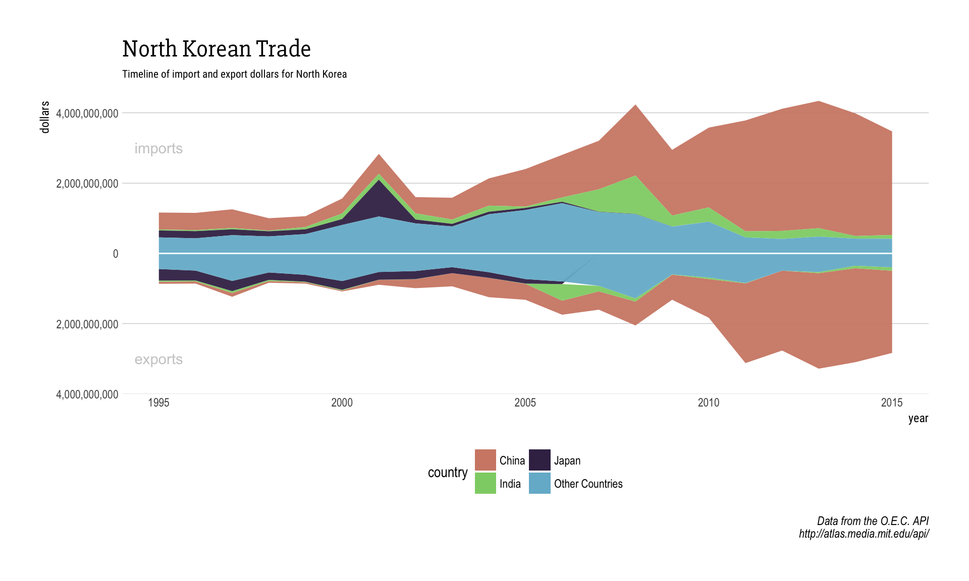
This is a start, and if we want to make it interactive like the example was we just need to wrap the plot with plotly::ggplotly. This looks good but apart from the oddity that happens in 2007 with Japan (when they ceased trade with North Korea), I think the smoothness is also something I want to change. Maybe there is something else we can try?
Streamgraph
The interactivity and style you get with ggplot + plotly are great, but like all things I wanted to see if there were any other options out there. As if on cue I stumbled upon the streamgraph package on github from @hrbrmstr. His examples are good looking and we already have some solid data from the API so let’s just give it a try.
import.data %>%
  streamgraph("Group.2", "x", "Group.1", offset="zero") %>%
  sg_axis_x('Group.2')%>%
  sg_axis_y(tick_format = '$.0s')%>%
  sg_fill_brewer("Spectral")

export.data %>%
  streamgraph("Group.2", "x", "Group.1", offset="zero") %>%
  sg_axis_y(tick_format = '$.0s')%>%
  sg_fill_brewer("Spectral")