Below is a tutorial that helps take ZIP code data and, with R, get rough latitude and longitude data from them as well as County. Then using ggplot2 we can create a nice visual of the data plotted at the county level. The first section was written as part of a larger project and I like to keep it around as it was one of the first tutorials on this website. The latter part though is being continually updated because my ability and the availability of new packages in R are always changing.
First we will need a file with some ZIP code data. Let’s visit the USDA Local Food Directories page via the link below and get some Farmer’s Market Data.
Directly below the table there is an ‘Export to Excel’ button. Which we can download and load directly into R using read.csv which gets us some data to start with.
Now that we have that loaded we can start exploring some of the data. This post, because it was written so long ago, stopped at just plotting the csv points to a map, we are going to do a little more now. But we still want to get the latitude and longitude for the ZIP codes. So let’s start with getting a count of markets by ZIP, then merging our ZIP codes data with those counts. Make sure to have the packages at the top installed.
library(zipcode)
library(tidyverse)
library(maps)
library(viridis)
library(ggthemes)
library(albersusa)#installed via github
#data
fm<-Export <- read_csv("~/Downloads/Export (1).csv")#the file we just downloaded
data(zipcode)
fm$zip<- clean.zipcodes(fm$zip)
#size by zip
fm.zip<-aggregate(data.frame(count=fm$FMID),list(zip=fm$zip,county=fm$County),length)
fm<- merge(fm.zip, zipcode, by='zip')
Great! Now we have a dataframe that contains the ZIP code, a count of the farmer’s markets, the city, state latitude and longitude. So we want to map this, to show all of our farmer’s markets by ZIP, and we will use the viridis package for the color scale. *Update: If you have been here before you will notice the base plot has changed, I wanted to update it to make the whole thing look a bit better.
us<-map_data('state')

ggplot(fm,aes(longitude,latitude)) +
  geom_polygon(data=us,aes(x=long,y=lat,group=group),color='gray',fill=NA,alpha=.35)+
  geom_point(aes(color = count),size=.15,alpha=.25) +
  xlim(-125,-65)+ylim(20,50)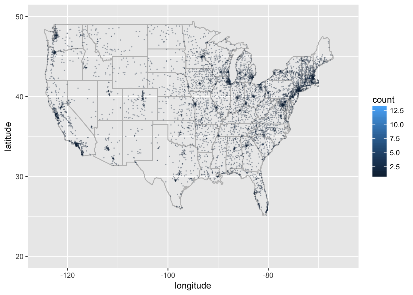
Expanding on this idea
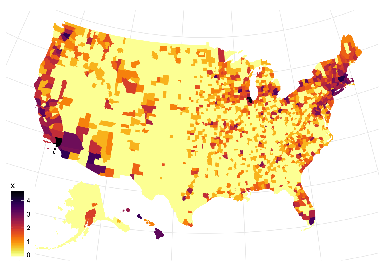
UPDATE: One problem I have is whether or not to revisit old posts. One view I have is that it was the extent of my knowledge at the time and the other is that it is a tutorial and I should improve on them when I can. Cue the recent emails and comments about expanding the graph to include Alaska, Hawaii, as well as less cumbersome code and here we are. Luckily with a couple more lines and an additional package or two we can make an updated and better looking map.
fm.counties<-aggregate(fm$count,by=list(fm$county,fm$state),sum)
names(fm.counties)[1:2]<-c('county','state')
cty_sf <- counties_sf("aeqd")
cty_sf$county<-as.character(cty_sf$name)
cty_sf$state<-as.character(cty_sf$iso_3166_2)
data.fm<-left_join(cty_sf,fm.counties,by=c('state','county'))
data.fm$x<-log(data.fm$x)
data.fm$x[is.na(data.fm$x)]<-0
Now we plot, and with the data from albersusa we joined to the farmer’s market data we can use the new geom_sf (if you are having trouble try installing the dev version of ggplot2 via github).
data.fm %>%
  ggplot(aes(fill = x, color = x)) +
  geom_sf() +
  scale_fill_viridis(option = "B",direction=-1) +
  scale_color_viridis(option = "B",direction=-1) +
  theme_map(base_size=11)