During the week I come across different articles, stories, posts even tweets that inspire or intrigue me and they end up in a list of things for me to revisit. Usually the subject is something that I know very little about but I want to. This week was no exception. I stumbled on an article from FiveThirtyEight titled More Americans Are Dying From Suicide, Drug Use And Diarrhea and was intrigued. In the past I have looked into CDC Wonder data but this seemed to be much more of a narrative around the data that the Institute for Health Metrics and Evaluation IHME puts out and the article summarizes it saying; ‘Even as the trends differ, however, they have something in common: huge disparities by region and sometimes even within states.’
After looking into the data I thought I wanted to look for myself specifically at the infectious diseases mentioned in the article to learn more.
Getting the data
First off this fantastic dataset is available on the IHME data portal GHDx which stands for the Global Health Data Exchange. It is available as an Excel file that is multi-tabbed but for the purpose of this I created a tidier version of it available in my Dataset-List github repo. That way we don’t spend too much time on the tidying part.
To do this we will need a few different packages.
First is the tidyverse which helps us get the data into something we can work with. Secondly is albersusa a great package from creating great map projections. The other two are personal preferences, with the RColorBrewer providing the color palettes and my personal package awtools which is just my playground for different themes and functions that I use on this website.
library(tidyverse)
library(albersusa)
library(RColorBrewer)
library(awtools)
#you may need to download the dev ggplot2 to get sf to work, if so:
#devtools::install_github('tidyverse/ggplot2')

diseases <- read.csv('https://raw.githubusercontent.com/awhstin/Dataset-List/master/diseases.csv', stringsAsFactors = FALSE)tidyverse it is only a few steps away. It is also one of my favorites:
Personal #rstats tidy nugget: use arrange, group_by, slice combo to get top n rows in different categories. Example using the babynames 📦 to get top 25 names by year and sex.
— Austin Wehrwein (@awhstin) April 19, 2018
babynames %>%
arrange(desc(n)) %>%
group_by(year,sex) %>%
slice(1:25)
state_diseases<- diseases%>%
  select(c(2,4:6)) %>%
  mutate(state=gsub(".*, ", "",Location))
top_states <- state_diseases %>%
  group_by(Disease,state) %>%
  summarize(mean.change=mean(Percent.Change)) %>%
  arrange(desc(mean.change)) %>%
  group_by(Disease) %>%
  slice(1:5) %>%
  ungroup()
Now that we have states separated from the Location field and summarized the Percent.Change field we can visualize which of these states saw the highest changes.
ggplot(top_states, aes(x=state, y=mean.change, fill=Disease)) +
geom_bar(stat='identity', show.legend = FALSE) +
facet_wrap(~Disease, ncol = 2, scales = 'free') +
a_primary_fill() +
a_plex_theme() +
theme(axis.text.x = element_text(angle = 90, hjust = 1))+
labs(caption='Data from the IHME Global Health Data Exchange\n
http://ghdx.healthdata.org/us-data')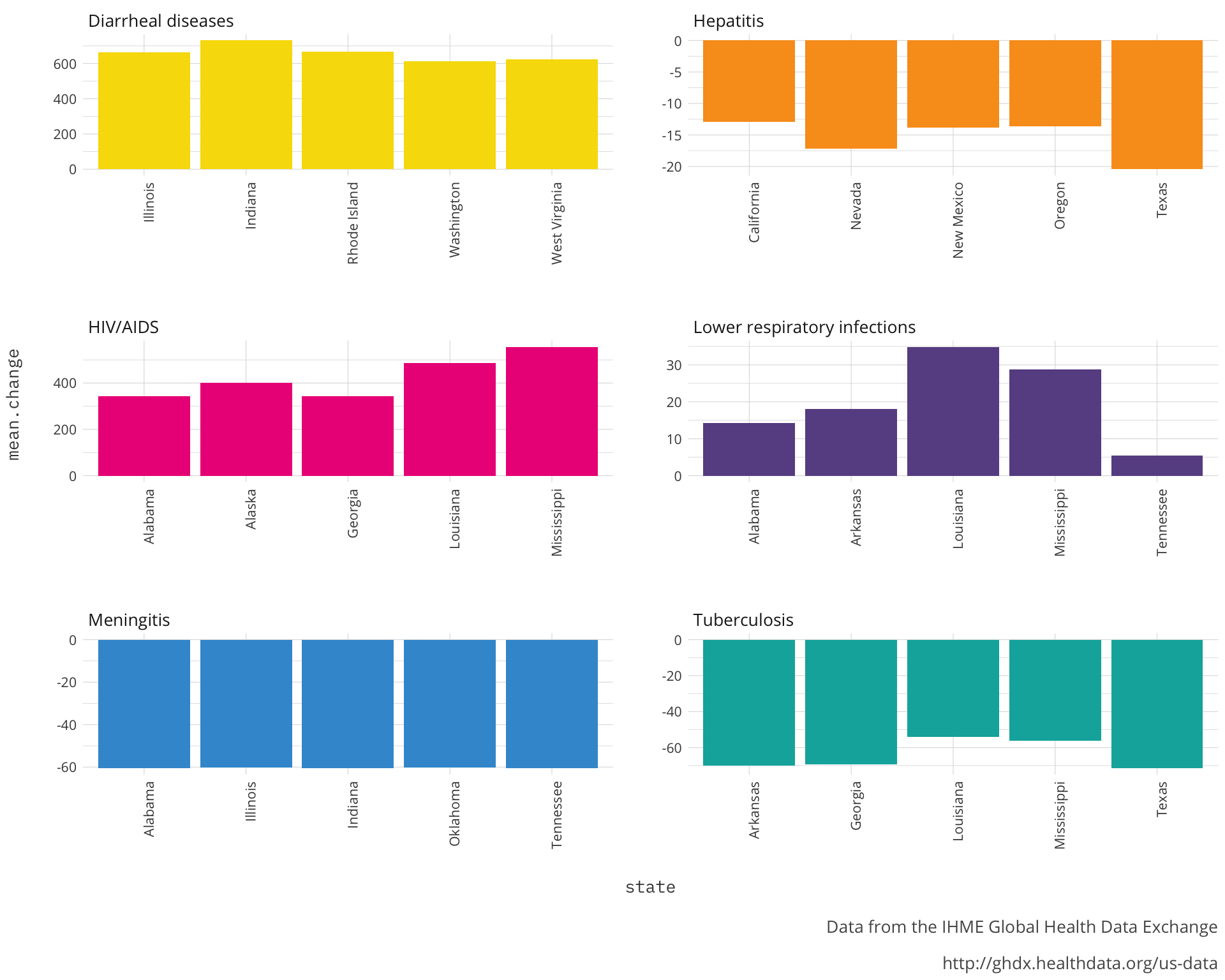 Looking at each of the diseases I can see that there is a commonality of region to most the states within each. It would be interesting to know where saw the highest changes at the county level. This should further corroborate our story that there is a strong regional aspect to the changes we are seeing in the infectious disease rates. We will look at the absolute value of percent change because there are some diseases that are showing decline.
top_diseases <- diseases %>%
  arrange(desc(abs(Percent.Change))) %>%
  group_by(Disease) %>%
  slice(1:8)
Now plot.
ggplot(top_diseases,aes(x=year,
                        y=rate,
                        color = Disease )) +
  geom_line(data = diseases,
            aes(group = Location),
            colour = "grey",
            alpha = .2)+
  geom_line(show.legend = FALSE)+
  geom_label(data = subset(top_diseases, year == 1995),
             aes(label = gsub(',','\n', Location),
                 x = year,
                 y = rate*1.5,
                 group = Disease),
             show.legend = FALSE,
             family = 'IBM Plex Mono',
             size = 3,
             nudge_y = 1)+
  facet_wrap(~Disease, ncol = 2, scales='free_y')+
  a_primary_color()+
  labs(title='U.S. Infectious Diseases',
       subtitle='Mortality rates per 100,00 persons by county from 1980-2014. Counties that have the highest absolute percent change are highlighted.',
       caption='Data from the IHME Global Health Data Exchange\n
       http://ghdx.healthdata.org/us-data')+
  a_plex_theme()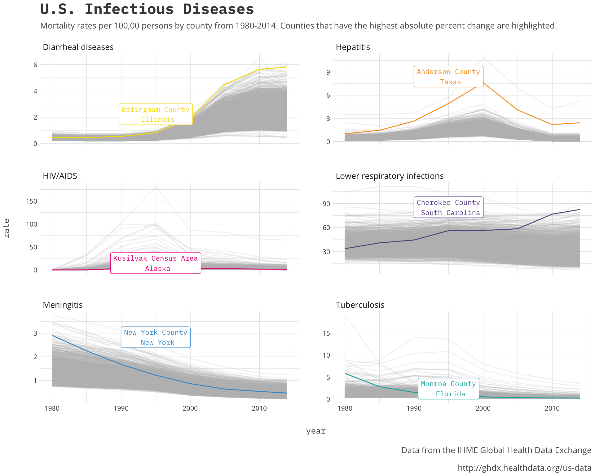
It is interesting to see the general direction of the changes by disease and the counties that are highlighted back up that regionality aspect. These counties and the other top counties should be the centers of the regions if we only had some sort of geographic visualization we could use.
Let’s do that
Using the albersusa package we can match our data to the simple feature geometry the package provides us. I also want to create a state version of the same projection to add state outlines to our chart.
#percent changes
change_disease<-diseases %>%
  select(c(2,3,4,5)) %>%
  distinct()
#sf object
cty_sf <- counties_sf("aeqd")
cty_sf$Location<-paste0(cty_sf$name,' ',cty_sf$lsad,', ',cty_sf$state)
cty_disease<-left_join(cty_sf, change_disease, by=c('Location'))
names(cty_disease)[9]<-'geometry'

#us states
us <- usa_sf('aeqd')
us_map <- fortify(us, region="name")
One of the interesting charts from the original article was looking specifically at the Percent.Change of lower respiratory infections. Let’s take a look at that first, we should see the area around where Louisiana and Mississippi meet as the focal point based on the states that came up in our first look.
ggplot(subset(cty_disease, Disease=='Lower respiratory infections'), aes(fill = Percent.Change, color=Percent.Change)) +
geom_sf() +
scale_fill_distiller(palette = 'Spectral', na.value = 'white') +
scale_color_distiller(palette = 'Spectral', na.value = 'white') +
geom_sf(data=us_map, color='white', size=0.25, fill=NA)+
a_plex_theme() +
theme(axis.text.x = element_blank(),
axis.text.y = element_blank()) +
labs(title='Lower respiratory infections', subtitle='Change in mortality rates per 100k persons from 1980-2014',
caption='Data from the IHME Global Health Data Exchange\n
http://ghdx.healthdata.org/us-data')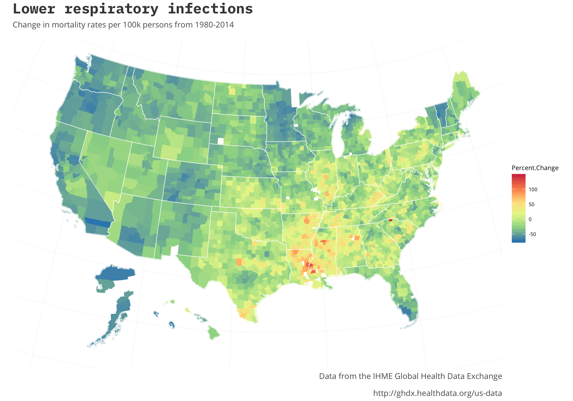 It looks like that is the case. As the original article states it looks like the disparity of regions is only growing. In some parts of the country there was a marked decrease in the rates whereas others have grown. Most of the growth seems to be focused in one area. The original post doesn’t expand on some of the other infectious diseases so it would be interesting to note if they all are centered in the same regions. Let’s look at the other infectious diseases we have data to see.
HIV/AIDS
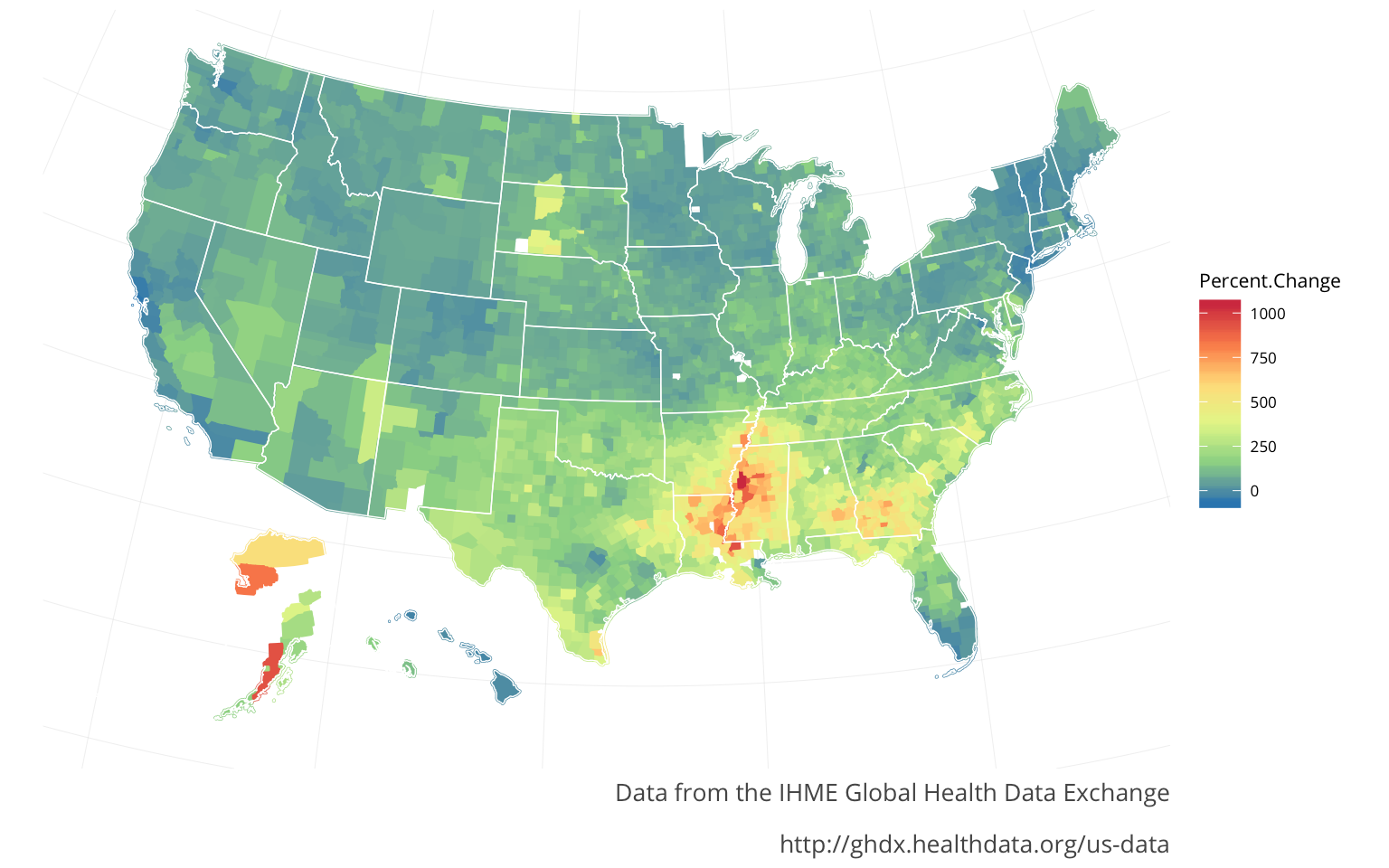
Diarrheal diseases
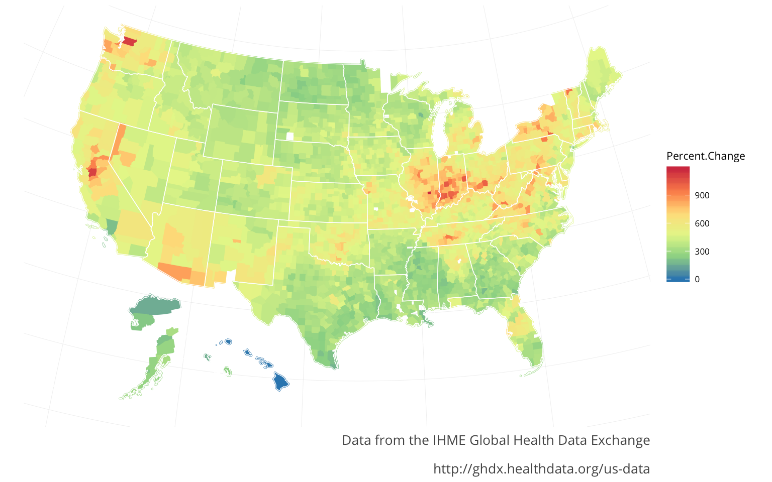 For both the HIVand the Diarrheal diseases there seem to be strong regional aspects to both of them. The HIVmirrors the Lower respiratory infections regions. The Diarrheal diseases are spread out in pockets, with peaks in California, Washington, & Illinois-Indiana seemingly indicating this is a different sort of regional aspect. The Diarrheal diseases were actually the only major infectious diease that increased nationally (from 2000-2014). The originaly article states that a lot of this was to do with a certain bacteria, commonly found in the aging population.
Final thoughts
Exploring this data and creating my own visualizations has helped me gain a better understanding not only of the article I found them in but also the narrative in general. For me doing this sort of secondary look, like this one that is inspired by another article or post, really substantiates the narrative that originally interested me. This leads to me hopefully being more knowledgeable and curious about the topic in the future.