Written on
Did you say eclipse?
Found in [R , maps] by @awhstin on
“There are no more eclipse maps to make”
— Joshua Stevens (@jscarto) August 3, 2017
Challenge accepted. pic.twitter.com/PnFJSXeSiY
Well put. There are a lot of iterations of similar data, but I wanted to take some time to chronicle some examples I really enjoy, and make one with R for myself. The first example is, of course, from FiveThirtyEight. Their article Two Minutes of Darkness with 20,000 Strangers is all about logistics. First is a striking map of traffic bottlenecks followed by a narrative that is supported by a table describing potential toilets needed for crowds in places. Interesting take.
The second is actually Google. More specifically Google Trends search data for the eclipse. It was pointed out via many posts (I am not sure which one was the first) that you can actually see the path of the eclipse via search trends. This is interesting to me because maybe it is because of more word-of-mouth mentions of the eclipse drives searching, or most people are informed on the actual path of it. Either way the data is interesting, especially when it is presented in such a striking way.
Well let’s make a version in R. (Sort of)data & cleaning
We need a couple datasets, and more than a few packages in R. The data is listed below
- Trend Data via Google Trends
- U.S. cities via SimpleMaps
- Path of the eclipse via NASA’s Scientific Visualization Studio
These can also be found here in a special Github repo for this post.
library(tidyverse)
library(fuzzyjoin)
library(hrbrthemes)
library(raster)

#trend data
gtrends<- read_csv("geoMap (3).csv", skip = 2)

#cities
us_cities <- read_csv("uscitiesv1.3.csv")
us_cities$name<-paste(us_cities$city,us_cities$state_id)

#shapefile
path.m<-shapefile("center17.shp")
path.points<-fortify(path.m)
If you start to inspect the trend data you’ll see it is by metro area. Instead of plotting it in that form I decided I wanted to match the cities in the metro area, and plot those by the search value. To do this we can use strsplit, but first we have to do a little arranging with dplyr::row_number to make sure the data is matched correctly.
#clean
gtrends$state<-substr(gtrends$DMA,nchar(gtrends$DMA)-1,nchar(gtrends$DMA))
gtrends<-gtrends%>%
  arrange(-row_number())%>% #so it all works together
  mutate(DMA=strsplit(as.character(DMA),'-'))%>%
  unnest(DMA)
names(gtrends)[1]<-'count'
Lastly, because some of the metro areas end with the state, we need to add the state abbreviation to the rest of them. Then using the handy fuzzyjoin::stringdist_left_join to aid us in matching some of those pesky counties that occur in other states and other problems. This is where we take a sharp left off of the paved road onto the beaten path of inaccuracy. There are more than a few errors but at 10:45pm at night I can live with them.
#add state
gtrends$name<-ifelse(substr(gtrends$DMA,nchar(gtrends$DMA)-1,nchar(gtrends$DMA))==gtrends$state,gtrends$DMA,paste(gtrends$DMA,gtrends$state))

#first go
first<-stringdist_left_join(gtrends,us_cities,by=c('name'),distance_col='dist')
trends<-subset(first,dist<=0 & state == state_id)
plot
Now we get to the fun part. I wanted to combine the center path line and color from the FiveThirtyEight article with the minimalist gradient scale of the Google Trends map. I remember using a U.S. county outline for a previous map and thought that offered a nice low-impact background to build on. Then it was just a matter of plotting the data we have matching so far.
labels<-subset(trends,count >=83) #for the labels

#plot
us<-map_data('county')
solar<-ggplot(trends,aes(lng,lat)) +
  geom_polygon(data=us,aes(x=long,y=lat,group=group),color='#dedede',fill=NA,alpha=.45,cex=.35,show.legend = F)+
  geom_point(aes(color=count,size=count),alpha=.55,show.legend = F) +
  geom_line(data=path.points,aes(x=long,y=lat),color='#c52828',size=4,alpha=.25,show.legend = F)+
  geom_line(data=path.points,aes(x=long,y=lat),color='#c52828',size=1,alpha=.75,show.legend = F)+
  scale_colour_gradient(low = "white", high = "#444444")+
  theme_ipsum(grid=F,plot_title_family = 'Slabo 27px',plot_title_face = 'bold',subtitle_size = 10,base_family = 'Roboto Condensed')+
  theme(axis.title.x=element_blank(),
        axis.text.x=element_blank(),
        axis.ticks.x=element_blank(),
        axis.title.y=element_blank(),
        axis.text.y=element_blank(),
        axis.ticks.y=element_blank())+
  xlim(-135,-65)+ylim(20,50)

solar+
  labs(title='Google Trends for \'Solar Eclipse\'',
           subtitle='Data for time period between 7/25/17 & 8/1/2017',
           caption='Search data from Google Trends\nSolar Eclipse Path Shapefile from NASA')+
  geom_text(data=labels,aes(label=name.x,size=14),family='Roboto Condensed' ,show.legend = F,check_overlap = T)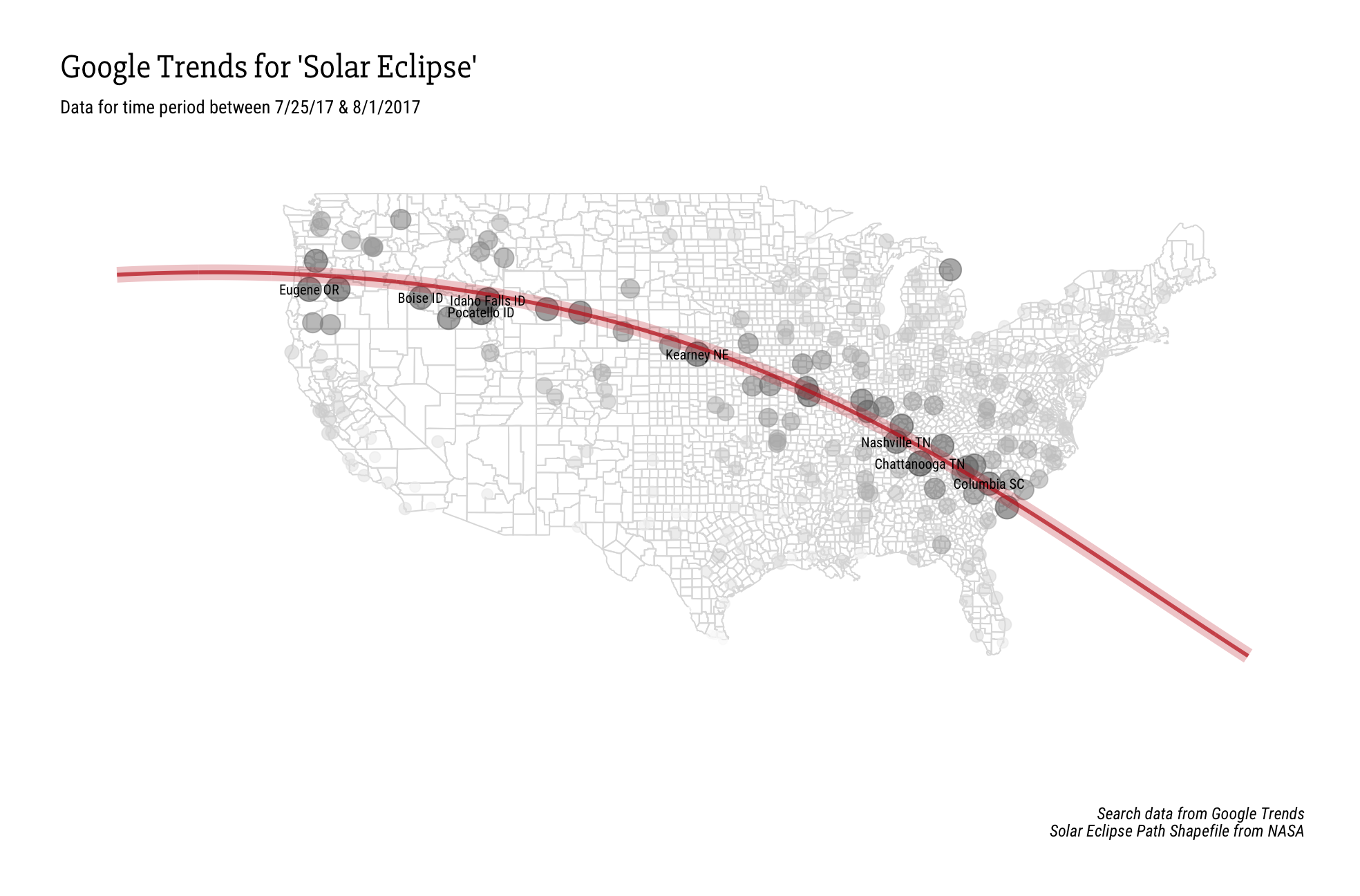
If you aren’t happy with this, or have other ideas I would love to see other interpretations of this data with R, or even improvements to this if you want.