I spend a lot of time sifting through articles shared on Twitter trying to break up the monotony of the commute with fascinating stories, interesting research or compelling data visualizations. Few websites are more intriguing to me then The Pudding. Their combination of in-depth articles, stories, and fantastic data visualizations makes each piece a must-read.
The Pudding is known for some amazing scrolly-telling pieces and this past week I came upon one such story: What makes a titletown?. This article sets out to answer the question, ‘Of all the cities to field a professional or college level team in the last 150 years, which is the winningest?’. The article is fascinating but the thing that caught my eye was the interactive visual for Case 1.
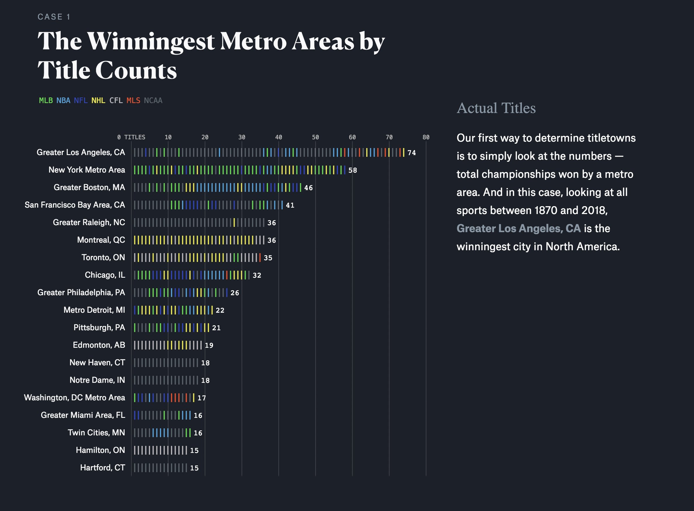
This plot, a sort of fixed-width stacked line (bar?) plot, resonated with me. I thought that it helped not only tell the story of the winningest metro areas but also allowed the reader to see trends within those areas and the interactivity expanded on that. As I was reading it also occured to me that I had not* seen something similar done with ggplot2 and wondered… Can I do that?
*Not suggesting it has not been done, just that I either have not seen it or more likely don’t remember seeing it. So seeing some free time this week I just wanted to give it a go.
library(tidyverse)
library(awtools) #just for the plot themes

#data from the Pudding repo
titles <- read.csv('https://raw.githubusercontent.com/the-pudding/data/master/titletowns/titles.csv',stringsAsFactors = FALSE)
The pudding has a great github repository with the data they use in their articles so I thought we should start there. Once loaded in it is just a matter of organizing things to make it easier to plot. First grabbing the top metros, then creating a cleaner group variable and filter on those top metro areas.
top.titles <- titles %>%
  group_by(winner_metro) %>%
  summarize(n=n()) %>%
  top_n(.,21) %>%
  ungroup()

titles.type <- titles %>%
  mutate(type = case_when(
    level == 'college' ~ 'NCAA',
    TRUE ~sport)) %>%
  inner_join(.,top.titles)
Now for the trickier part. I didn’t explore if it was possible to use geom_dotplot by somehow changing the geom type, instead I decided to start with geom_bar since I have actually made something similar to this by accident. The main pieces are providing a 1 for the y variable. and then tweaking the width and size within geom_bar.
ggplot(titles.type, aes(reorder(winner_metro,n), 1, color=type)) +
coord_flip() +
geom_bar(stat='identity',
aes(group=rev(index), fill=type),
width=.75,
color='white',
size=1.25,
alpha=.85
) +
a_primary_fill() +
geom_label(aes(label=n,y=n+2), family='IBM Plex Sans', color='#444444', label.size = 0, size=3) +
a_plex_theme(plot_title_size=27.5) +
labs(
title='Winningest Metro Areas',
subtitle='Count of titles from 1870-2018 by North American metro area.',
x=NULL,
y=NULL,
fill=NULL,
caption='Data & Chart Inspiration from The Pudding:\nhttps://pudding.cool/2018/11/titletowns/'
)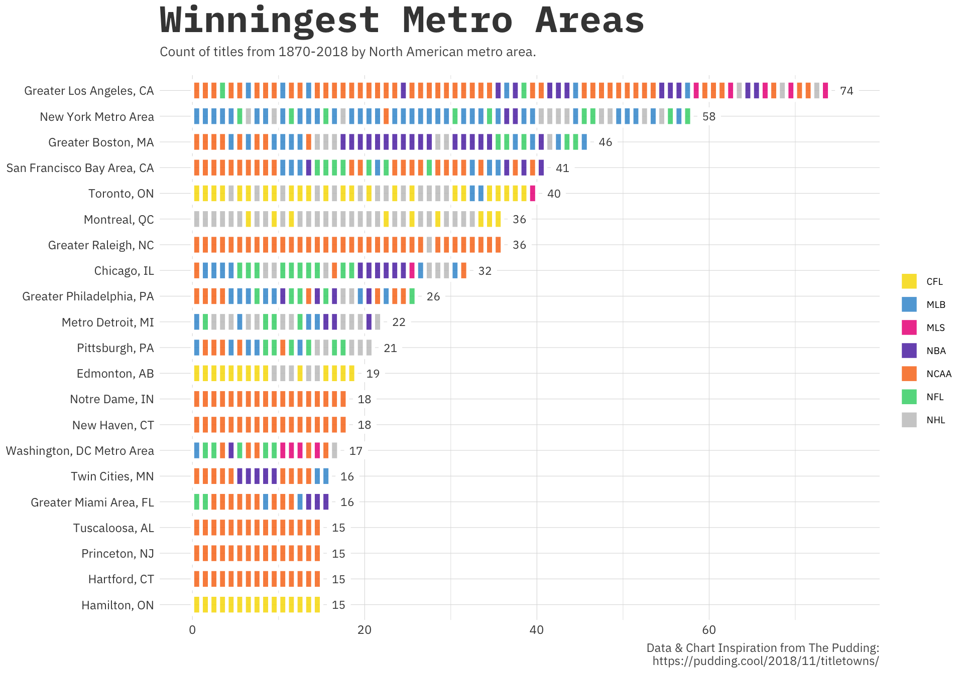 Though the original was interactive I think this static version still tells an interesting story. The bars are in chronological order for each metro area which was part of the original appeal for me. There are cities, like Chicago, where you can see the string of NBA wins that correspond to that famed Bulls team with Michael Jordan. This ended up being more straightforward than I originally thought but it was a great exercise that I am sure I will use for a couple projects I have coming up at work.
Thanks for following along. Also I recently updates the package I use for every visualization on this site, awtools 0.2.0, take a look at what’s new on github.