On this website I use awtools which is a light (read not fully built) aesthetics package for all the charts and visuals. Every once in awhile I like to make tweaks so I thought I could take a minute to display some of the edits I made. Most the changes are to the color palettes, but there are a few spacing edits as well as tweaks to dark theme so why not makes a few charts. To do this we are going to need some data. Not too long ago I came across an article, The Cost of Hurricane Harvey: Only One Recent Storm Comes Close, which was discussed at length on Twitter for its visualization merit and I have long been interested in the data so that seems like a great dataset to revisit.
library(rvest)
library(ggplot2)
library(dplyr)
library(awtools)
library(ggbeeswarm)
library(ggforce)

#Natural Disasters from the NYT article
disasters <- read.csv('https://static01.nyt.com/newsgraphics/2017/08/29/expensive-storms/79088630ae1af934d7840e104a0e3f1e8a6c7bf1/data-2.tsv',
                      sep='\t',
                      stringsAsFactors = FALSE)

costs <- disasters %>%
  mutate(
    Disaster=case_when(
      col2 == '#397dc2' ~ 'Hurricane',
      col2 == '#efba2b' | col2 == '#9b0e11' ~ 'Drought/Fire',
      col2 == '#699d8f' ~ 'Flooding',
      col2 == '#9d76b0' ~ 'Storm',
      col2 == '#61c6e2' ~ 'Winter Storm'
    )
  )
Now that the data is grouped I think the first question I would want to answer is a simple one: what does the distribution of disasters look like? I will group by disasters then plot them along a timeline so why not also use the new a_dark_theme which is my default theme using the IBM Plex Mono with a dark background and a couple other minor tweaks. We can size by the cost of the disaster and try to see if we notice any trends.
ggplot(costs, aes(x=year,y=Disaster,color=Disaster))+
  ggbeeswarm::geom_quasirandom(alpha=.75,aes(size=cost),groupOnX = FALSE, show.legend = FALSE)+
  a_dark_theme() +
  a_main_color() +
  labs(title='Billion Dollar Natural Disasters',
       subtitle='The most costly naturdal disasters from 1980 - 2017',
       y='',
       caption='Data: New York Times\nOriginal Article: "The Cost of Hurricane Harvey: Only One Recent Storm Comes Close"')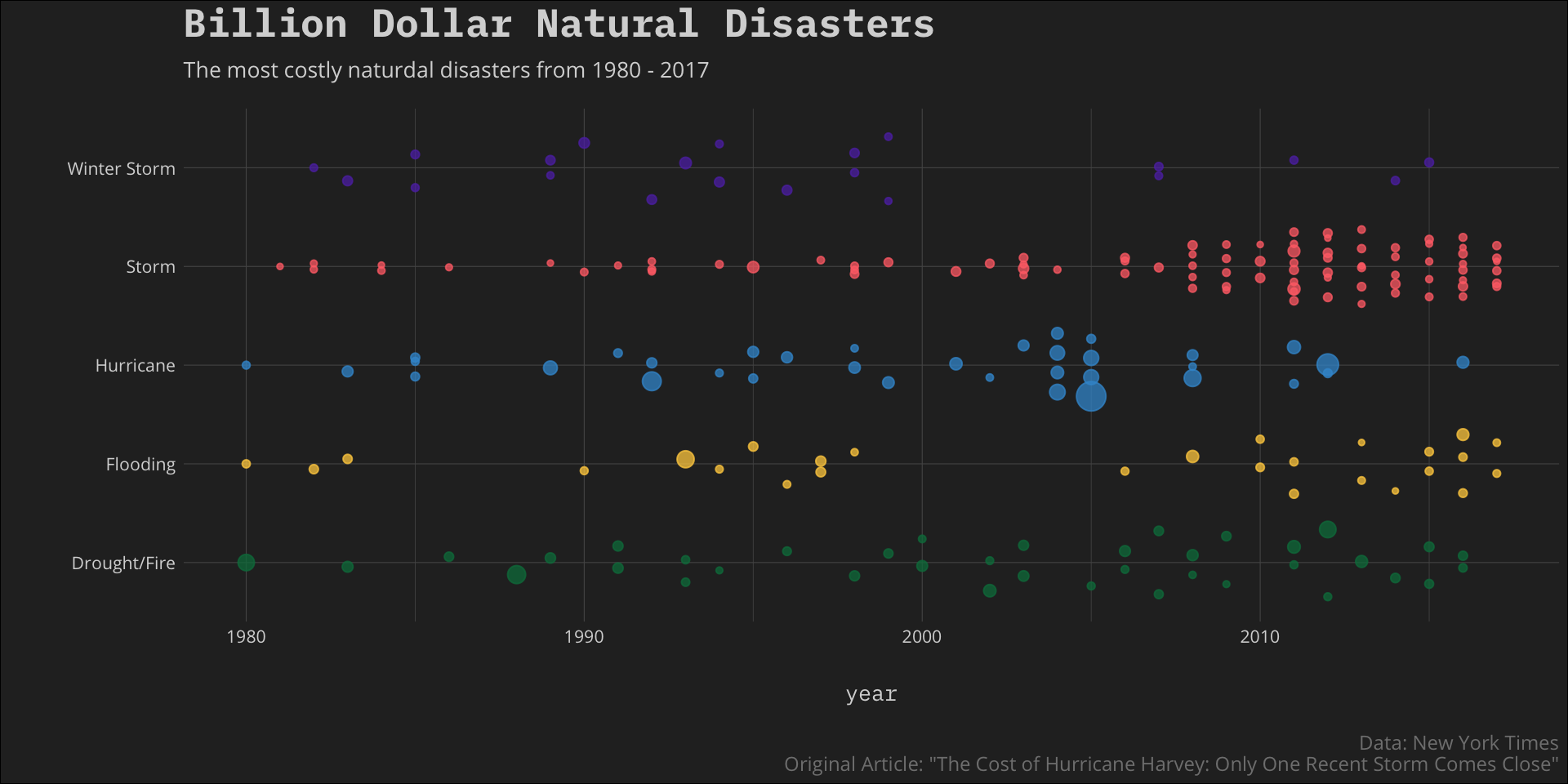
Although it looks like there may be a slight upward trend in number of disasters overall there are clear increases in the Drought/Fire and Storm groups. This makes me ask then what do these sorts of trends do to the cost of the disasters, maybe something like a running total of cost of disaster year over year.
We already have the data so let’s do it.
total.cost <- costs %>%
  group_by(Disaster) %>%
  arrange(Disaster,year) %>%
  mutate(total = cumsum(cost))
Now that we have the running total of cost we need to display it. I think some sort of hybrid line chart that also has points indicating the disasters themselves.
#running total
ggplot(total.cost, aes(x=year,
                       y=total,
                       fill = Disaster,
                       group = Disaster)) +
  geom_line(size=.5,aes(color=Disaster)) +
  geom_point(aes(color=Disaster)) +
  a_plex_theme() +
  a_main_fill() +
  a_main_color() +
  labs(title='Natural Disasters and Runaway Cost',
       subtitle='Running total of cost of natural disasters (over $1 billion in estimated cost) from 1980 - 2017',
       caption='Data: New York Times\nOriginal Article: "The Cost of Hurricane Harvey: Only One Recent Storm Comes Close"')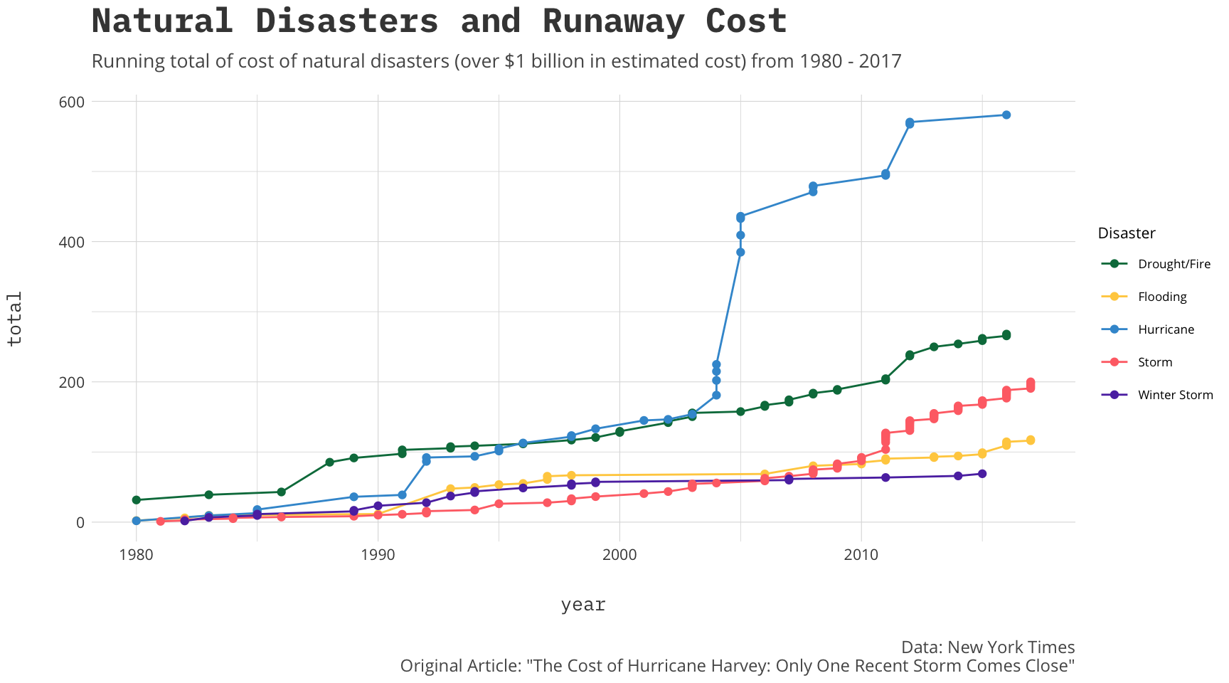
I see that the cost of hurricanes (even if I were to remove Katrina) have been rising a bit more rapidly than the other groups. Similarly we see that within the groups the steps seem to get larger since 2010.
My final question I want to ask of the data is a bit self serving and was inspired by this tweet.
I am super excited to finally give ggforce the update it deserves. Read all about the new CRAN release here #rstats #ggplot2 https://t.co/9XNxmqldQT
— Thomas Lin Pedersen (@thomasp85) March 7, 2019
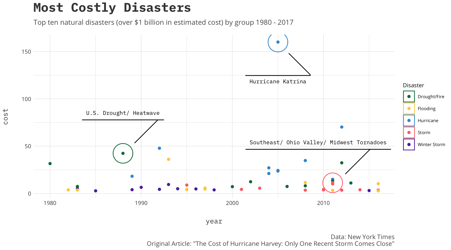
In this release there are tons of awesome new features but one I wanted to try was the new marking geoms that are included. To do this I will grab the top ten disasters in cost by group and plot them out over the years.
top.ten<-costs %>%
  group_by(Disaster) %>%
  top_n(n = 10, wt = cost)

labels<-costs %>%
  group_by(Disaster) %>%
  top_n(n = 1, wt = cost) %>%
  filter(!Disaster %in% c('Winter Storm','Flooding'))
Now we can use the new geom_mark_circle to label a few.
#running total
ggplot(top.ten, aes(x=year, y=cost, color = Disaster, group = Disaster)) +
  geom_point() +
  geom_mark_circle(data=labels, aes(label=name,
                                    color=Disaster,
                                    fill=NA),
                   label.family = 'IBM Plex Mono',
                   label.fontsize = 8,
                   label.fill = NA,
                   label.fontface = 'plain') +
  a_plex_theme() +
  a_main_fill() +
  a_main_color() +
  labs(title='Most Costly Disasters',
       subtitle='Top ten natural disasters (over $1 billion in estimated cost) by group 1980 - 2017',
       caption='Data: New York Times\nOriginal Article: "The Cost of Hurricane Harvey: Only One Recent Storm Comes Close"')