The Premier League just ended and normally this time of year is just spent reading up on transfer news until the league starts again, but not this year! It is a World Cup year which means that as of today the (real) biggest sporting event in the world kicks off. Some of you may know I (sort of) kept up my English Premier League predictions and while I am not doing the same for this World Cup I do have my own picks. I am proudly very German but with the United States not qualifying I find myself wanting to follow who I think plays the most exciting football. My recipe is simple, one part passion, two parts admiration of their game, and one part ‘not Brazil’.
My Picks
Finals: France vs. Germany
Winner: Germany
Who I’ll support: England
I have really enjoyed the news coverage and awesome data visualization centered pieces that have come up for this World Cup. There are a number of really cool sites to follow that offer some great articles to get acquainted with the teams, as well as updates during games. Here are some of my favorites:
Getting started
- FiveThirtyEight - Which World Cup Team Should You Root For?
- New York times - World Cup 2018: Guide
Following along
- FiveThirtyEight - 2018 World Cup Predictions & Matches
- The Guardian - World Cup 2018 live
- Fox Sports - FIFA World Cup Live
Interesting reads
- The Telegraph - What makes a World Cup winner?
- National Geographic - See Which World Cup Teams Have the Most Foreign-Born Players
Reading through some of these articles I started to get the sense of how analysts and reporters were comparing the different international squads and started to get some ideas of my own. One reoccuring theme was the comparison of some of the different nations top players, often referring to their performance during their respective club seasons. This is a good indicator of the player’s form and potential but international play is a different thing altogether. A lot of the nations with high value players don’t play together on the same club or even the same league so chemistry can be a problem.
sifting through the numbers
This is when I started to think that looking at the international team’s market value as a whole along with the FIFA ranking would be interesting. This would try to get at a sense of which of those team’s have decent players (market value) and chemistry (FIFA ranking) together.
First off we need some data. First off we can get the FIFA ranking from the FIFA website. Then we will need some market value data, which Transfer Markt provides via their World Cup 2018 page. This data along with using the rvest package we can get the information we need.
library(tidyverse)
library(rvest)
library(awtools) #optional: just for the graph aesthetics
#devtools::install_github('awhstin/awtools')
Once we have those loaded we can gather the data from the two sites and combine to get what we are interested in. If you want a very nice primer on working with the rvest package check out this tutorial over on the RStudio blog. All we need now is the CSS selector for the tables we need and then can import the data.
world.rank <-read_html('https://www.fifa.com/fifa-world-ranking/ranking-table/men/index.html') %>%
  html_nodes('.table') %>%
  html_table() %>%
  data.frame(.[1]) %>%
  mutate(Confederation = Var.20.1) %>%
  select(c(2,3,41)) %>%
  mutate(Team = case_when(Team == 'IR Iran' ~ 'Iran',
                          Team == 'Korea Republic' ~ 'South Korea',
                          TRUE ~ Team))

squads <-read_html('https://www.transfermarkt.com/world-cup-2018/teilnehmer/pokalwettbewerb/WM18') %>%
  html_nodes('#yw1 > table:nth-child(2)') %>%
  html_table(fill=TRUE) %>%
  data.frame(.[1]) %>%
  select(c(2, 4, 6, 7)) %>%
  transmute(
    Team = Club,
    Age = as.numeric(gsub(',', '.', Squad)),
    Percent.Abroad = unlist(lapply(strsplit(gsub(',', '.', WC.particip.), ' '), '[', 1)),
    Market.Value = parse_number(gsub(',', '.', Abroad))
  ) %>%
  mutate(Market.Value = as.numeric(ifelse(Team %in% c('France','Spain'), Market.Value*1000000000, Market.Value*1000000)),
         Percent.Abroad = as.numeric(Percent.Abroad))

#join data
squad.rank <- inner_join(squads, world.rank)
I did do some massaging to the data that I want to briefly mention. I first had to replace two teams names so they were consistent across both. I also had to format and clean some of the numbers so they were easy to work with. Once that was all done I joined the world rank data to the data from Transfer Markt of those teams that qualified for the World Cup. So now we can plot to see how the teams look.
#ggplot
ggplot(squad.rank, aes(reorder(Team, -Rank), Market.Value, color = Confederation)) +
geom_point() +
geom_linerange(aes(ymin = 0, ymax = Market.Value)) +
scale_y_continuous(labels = scales::comma)+
geom_text(aes(label = m.compress(Market.Value)), check_overlap = TRUE, family = 'Open Sans', colour = '#444444', hjust = -.25, size = 3) +
coord_flip() +
a_plex_theme(grid=FALSE) +
a_primary_color() +
labs(title='Doing more with less',
subtitle='A look at World Cup teams by FIFA rank and estimated team value by Transfer Markt',
x='Team (by FIFA rank)',
y='Market Value (€)',
caption='Market Value and Team data from Transfer Markt\nWorld Ranking and Confederation from FIFA')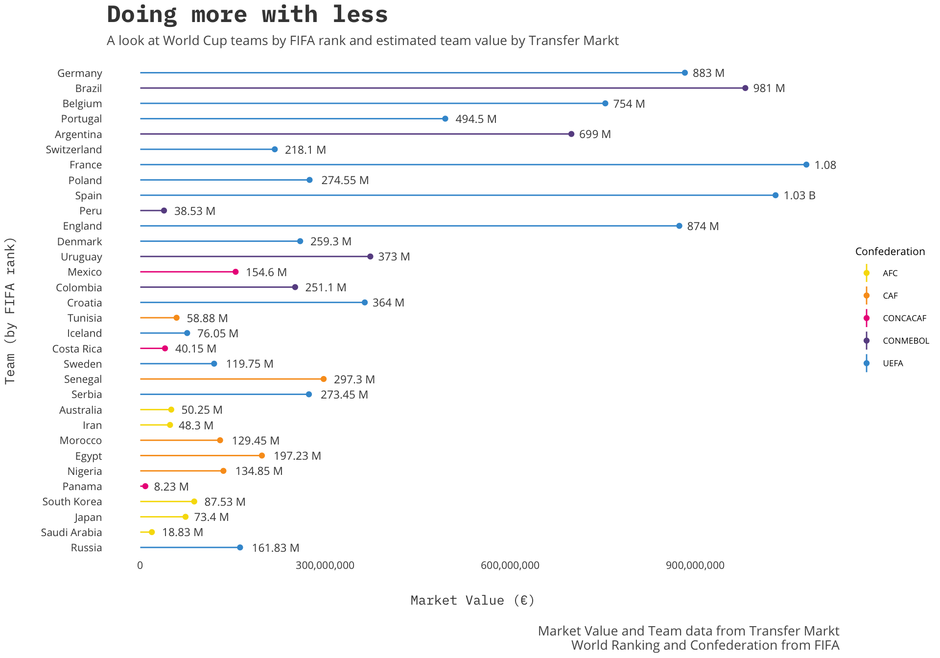 This is exactly what I wanted to see. It looks like, as I had expected, most of the top nations are also some of the most expensive but the few outliers are what is exciting. Teams like Switzerland, Poland, and Peru are teams that seem to be doing “more with less” (particularly Peru). That is not intended to be a slight to those nations but more just noticing that of those tops teams there must be some sort of chemistry specific to these teams outside of raw player value.
Another aspect of this graph that I added was the Confederation as the color group. This adds another interesting element that I think contributes to understanding the value vs. rank. Though Peru is valued drastically less than say Brazil or Argentina, it still is part of the CONMEBOL (South America) Confederation. This offers it some stiff competition that undoubtedly help make the team better.
I think we can zoom in a little more to get a sense of that chemistry by looking at the percentage of players who play abroad. Luckily that is already included!
ggplot(squad.rank, aes(reorder(Team, -Rank), Percent.Abroad, fill = Confederation))+
geom_bar(stat = 'identity') +
coord_flip() +
a_plex_theme(grid = FALSE) +
geom_text(aes(label = Percent.Abroad), check_overlap = TRUE, family='Open Sans', colour='#444444', hjust=-.25, size=3)+
a_primary_fill() +
labs(title='Nobody\'s home',
subtitle='A look at World Cup teams by FIFA rank and percent of players who play abroad.',
x='Team (by FIFA rank)',
y='Percent Abroad',
caption='Team data from Transfer Markt\nWorld Ranking and Confederation from FIFA')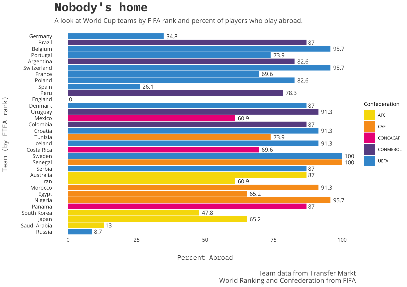 Germany, Spain and England (with an astounding 0% of players playing abroad) top the charts as the highest ranked teams with the lowest percentage of players playing in leagues abroad. This hints at an idea echoed through many articles discussing World Cup performance. The theory is that playing in the same league, not even in the same league, helps chemistry more than many players across disparate leagues. If that is true a nation like England, highly ranked and low percent abroad, could actually make a bigger splash than predicted.
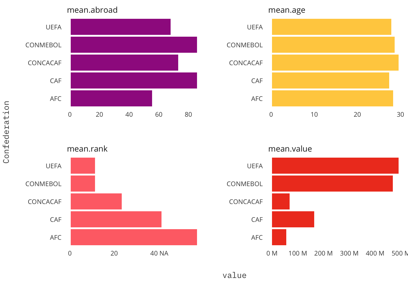
Clearly, and to be expected, the European and South American (UEFA, CONMEBOL respectively) confederations make up nearly all of the top half of teams. To round out this primer I wanted to provide some confederation stats.
confederation <- squad.rank %>%
  group_by(Confederation) %>%
  summarize(mean.age = mean(Age),
            mean.abroad = mean(Percent.Abroad),
            mean.value = mean(Market.Value),
            mean.rank = median(Rank)) %>%
  ungroup() %>%
  gather(type,value,2:5)
ggplot(confederation,aes(x=Confederation, y=value, fill=type)) +
geom_bar(stat='identity', show.legend = FALSE) +
coord_flip() +
facet_wrap(~type, scales = 'free', ncol = 2) +
scale_y_continuous(labels = m.compress)+
a_plex_theme(grid=FALSE) +
a_secondary_fill()