I, like many of you I am sure, spend most of my time during the day on around or in front of the screen. Every once in awhile I come across an intriguing chart, a compelling article, or some very data that I want to inspect for myself. I have done a few of these in different iterations like a couple of my recent posts, A look into U.S. infectious diseases and Friday Fun: Comparing annual ACS data with tidycensus. Though the past few weeks I have been fairly disengaged with Twitter, and the website, I came across another bit of visualization inspiration that I first saw on Alberto Cairo’s feed.
First off if you are interested in data visualization at all (which I assume you are since you somehow found this) you should give him a follow. When I saw this I remembered reading an article earlier in June that dealt with this subject. This article, Where Killings Go Unsolved and the database mentioned in the tweet provided me with a couple hours of engaged learning, reading, and consuming. The maps of different cities showing where unsolved homicides happen, the charts breaking out city by city data was to me a supreme example of data journalism and I had to take them up on the offer of the data via their Github.
The most compelling piece for me was the connected dot-plot (thanks to Andy Kirk’s Chartmaker Directory for the nomenclature) detailing the different cities and how their arrest rates compared by race. Though the originaly graphic was highly inspiring I wanted to take it and iterate on it by adding a highlight to illustrate the cities that have the worst disparities between the arrest rates.
First the data
library(tidyverse)
library(extrafont)
library(ggrepel)
library(awtools) #just for theme
homicides<-read_csv('https://raw.githubusercontent.com/washingtonpost/data-homicides/master/homicide-data.csv')

#1. clean/add
homicides<- homicides %>%
  mutate(race=ifelse(victim_race == 'White',"white",'minority'),
         arrested=ifelse(disposition=='Closed by arrest',1,0),
         open=ifelse(disposition!='Closed by arrest',1,0))

#2. overall city rate
cities<- homicides %>%
  group_by(city) %>%
  summarise(city.rate=sum(arrested)/sum(arrested,open)*100)

#3. rates by race
city.homicides<- homicides %>%
  group_by(city,race) %>%
  summarise(rate=sum(arrested)/sum(arrested,open)*100) %>%
  left_join(.,cities)

#4. purely for highlighting
hs<- city.homicides %>%
  group_by(city) %>%
  mutate(diff = round(rate - lag(rate, default=last(rate)))) %>%
  arrange(diff) %>%
  ungroup() %>%
  left_join(cities)%>%
  slice(1:10)
My comments are probably not helpful to you so let me briefly explain each part before we graph.
- Here I add three new variables to the data to help streamline the calculations I want to make and they are the count of arrests, and unsolved, and a grouping of race similar to the original graphic.
- We need to calculate the overall arrest rate by city.
- Here we calculate the solved murder rate by city and race, then join with the overall city rate.
- I want to highlight the cities with the largest differences in solved murder rates by race. So I compute the difference, join the city data for label positioning and grab the top 10.
Great. Now we can plot.
#plot plot plot
ggplot(city.homicides,aes(x=rate, y=city.rate, color=race,group=city)) +
geom_line(color=ifelse(city.homicides$city %in% hs$city,'#444444','#dedede')) +
geom_point(alpha=ifelse(city.homicides$city %in% hs$city,.75,.25),
size=ifelse(city.homicides$city %in% hs$city,2,1)) +
geom_label_repel(data = hs,aes(x=rate,y=city.rate,label=paste0(city,' ',abs(diff),'%')),
nudge_x = -1.5,
color='#444444',
family='IBM Plex Mono',
size=3) +
a_plex_theme() +
a_main_color() +
theme(legend.position="top") +
labs(x='Arrest rate by race\nof victim',
y='City arrest rate',
title='Unsolved homicides and the racial divide',
subtitle='A look at arrest rates by race of victim with the top 10 cities highlighting\nthe largest difference between arrest rates for minority and white victims.',
caption='Original data and inspiration by The Washington Post \n Data: https://github.com/washingtonpost/data-homicides')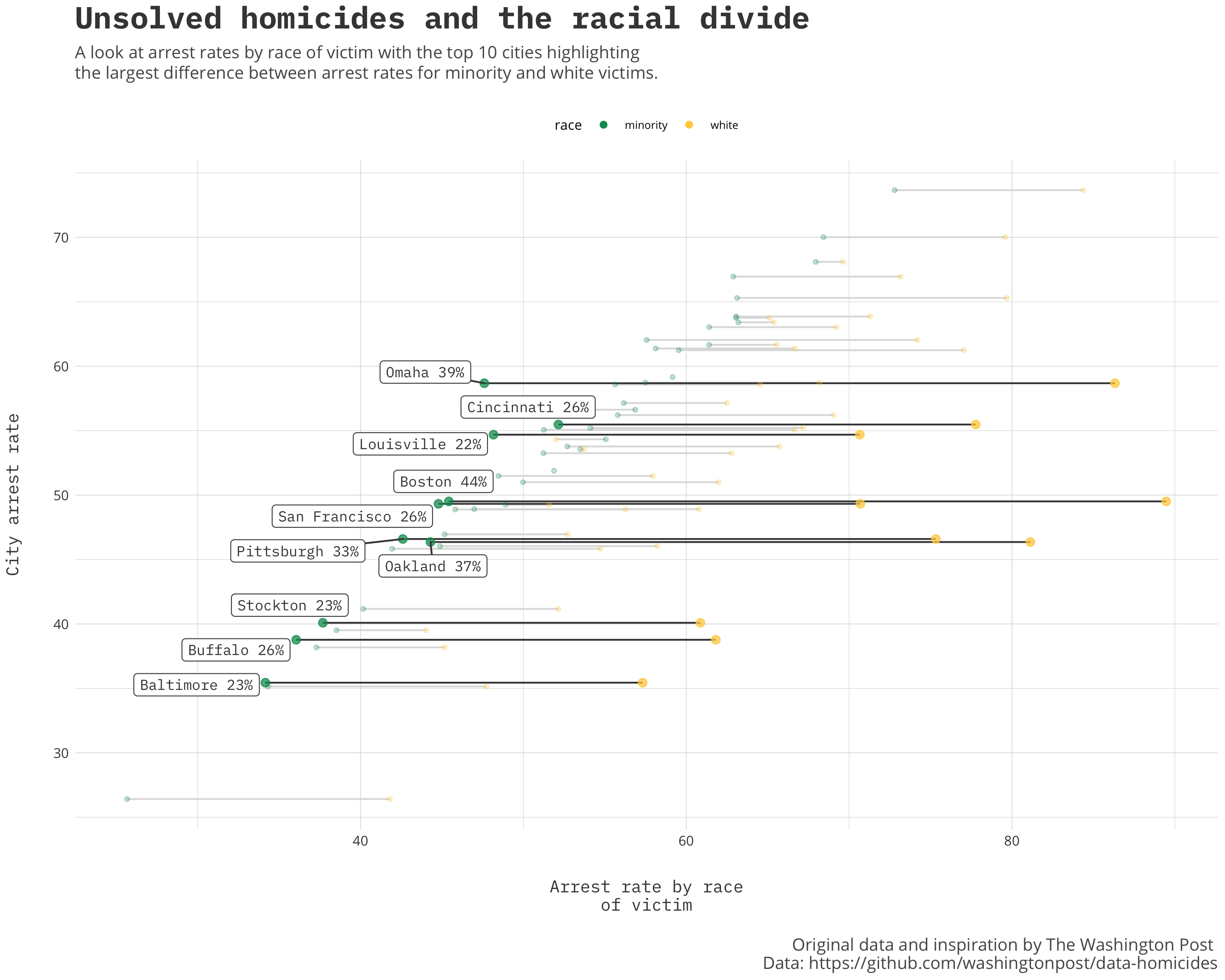 Though not an exhaustive list, the data is striking. The Post collected this data from 50 of the United State’s largest cities and though I am not an expert I think the tale could be consistent for a lot more cities not included. It is data journalism like this that makes you question, inspect, educate yourself because it puts the information into a narrative that leads you to insight. Follow organizations like the Washington Post Graphics and FiveThirtyEight on Twitter and read their articles for not only great examples of data journalism but also access to their process, line of thinking and the data so you can explore it for yourself.