Graph!? more like art
Every once in a while, I run into an article with some data that really intrigues me, and sometimes I run into a data visualization that makes me think, “How can I do something like that?” Sometimes they both happen simultaneously and I have to drop everything to start working on it. That happened to me with the 538 article, The Most Conservative And Most Liberal Elite Law Schools. Their visualization titled ‘The Wide-Ranging Politics of Elite Law Schools’ was something that immediately drew me in.
I spent a decent amount of time but did not arrive at anything I was too excited about. Then a couple months ago I ran across a @AndriyGazin tweet about his remake of the very same plot! I decided to take a page out of his book and offer my approach. He has some great files to work off of on his GitHub if you want to harvest your weather data. But in the interest of time, I just used a bit of data I had around.
Download CSV of temps in Lincoln, NE.
Code
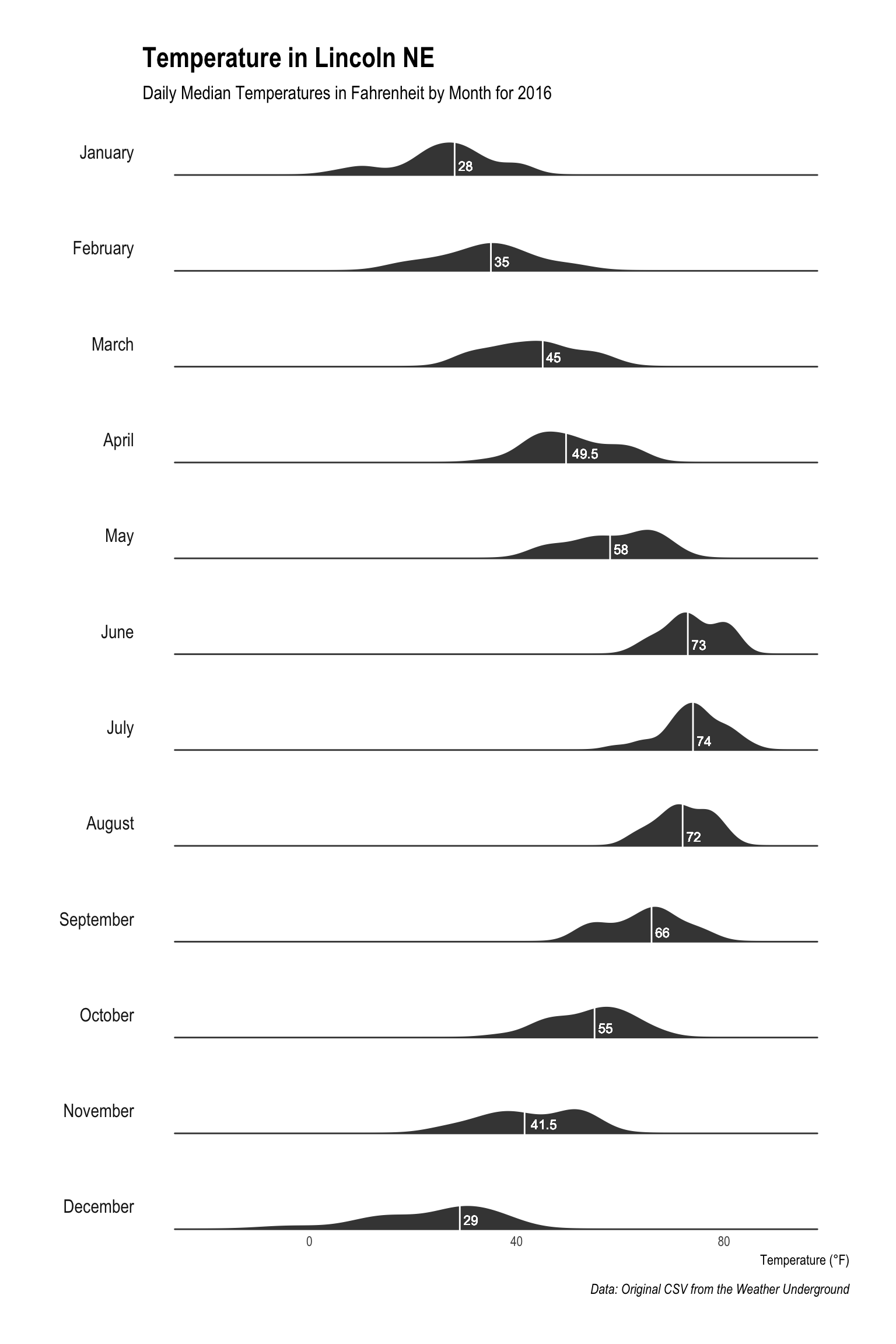
I think Andriy was going for more of a reproduction and, while I think he did a great job, I wanted to add some spins to it. The main element I wanted to add was the median label that would appear within the density shape. I thought this would add a nice minimal but important aspect. One note that; if you are going to use the CSV I provided, just delete the ‘#’ and work from there. Here I create the month labels and the factor to help order the months.
library(ggplot2)
library(hrbrthemes)

#library(readr)
#weather.raw<- read_csv("nebraska-2016.csv")
weather.raw$month<-months(as.Date(weather.raw$CST))
weather.raw$months<-factor(weather.raw$month, levels=unique(weather.raw$month))
Now one of the interesting aesthetic pieces of this plot is the scale that spans the entirety of the data. Especially in this example where you can see the temperatures as they occur during the month, along with the general trend. To do this we will first grab quick minimum and maximum values. Then we will aggregate the month data to find the median temperature of the median temperatures for the median line. After getting that we can just merge the original data and the aggregated data for ease in plotting.
#scales
mins<-min(weather.raw$Min.TemperatureF)
maxs<-max(weather.raw$Max.TemperatureF)

#median months
month.med<-aggregate(weather.raw$Mean.TemperatureF,by=list(weather.raw$months),median)
names(month.med)[1]<-'month'
weather.raw<-merge(month.med, weather.raw ,by=c('month'))
Once merged it is time for plotting. The geom_density aspect provides the main plot element, and the geom_vline is the median line that we calculated. The geom_text causes our plot element that I mentioned before to appear at the median value we calculated just above 0. Our original minimum and maximum calculations provide the scale. Then, all that’s left is to make changes to the aesthetics. Finally, the always stellar theme_ipsum from the ‘hrbrthemes’ package helps with the rest.
ggplot(weather.raw)+
  geom_density(aes(x =Mean.TemperatureF), fill = "white", color = "white", size = 3.5)+
  geom_density(aes(x = Mean.TemperatureF), fill = "#444444", color = "#444444", size = .5)+
  geom_vline(aes(xintercept = x), color='white')+
  geom_text(aes(x, 0.015, label = x, hjust=-.25), color='white',size=3)+
  scale_x_continuous(limits = c(mins, maxs))+
  facet_grid(months~., switch = "y")+
  theme_ipsum(grid=F)+
  theme(axis.title.y=element_blank(),
        axis.text.y=element_blank(),
        axis.ticks.y=element_blank(),
        strip.text.y = element_text(angle = 180, hjust = 1))+
  labs(x='Temperature (°F)',
       title='Temperature in Lincoln NE',
       subtitle='Daily Median Temperatures in Fahrenheit by Month for 2016',
       caption='Data: Original CSV from the Weather Underground')
Some may notice that I did not go for one of the more striking aspects from Andriy’s work, or from the original for that matter. I decided not to go for the overlapping values for a couple reasons, but mainly because I am not sure what value it offers. I am sure someone could convince me otherwise, but I was always taught that visualizations should feature normality in aesthetics so the abnormality in the data is easier to see. I would enjoy hearing thoughts on this matter but, as always, thanks for taking a look.