There are so many helpful guides out there that detail creating your our ggplot2 theme but from my experience there is a disconnect between the very useful (and detailed) getting started type tutorials and the one-off very specific (but no less detailed) extending tutorials. I work at an intersection with quite a few folks who have to create or maintain visualizations for lots of different and ever changing clients so I thought it would be interesting to detail a way I believe one could easily get up and running with custom themes.
The ggplot2 package already comes with some great out-of-the-box themes set up so this tutorial will be made using one of those as the sort of structure to add your customizations onto.
Here are some examples:

I am partial to theme_minimal so I think we will start there and we only need a couple packages to get started.
library(tidyverse) #ggplot2 et al
library(gcookbook) #just for sample plot data
library(RColorBrewer)
Company colors come first
A lot companies may already have a corporate color palette but some who don’t already have made some decisions around color that is present in their logo or on their website. Since this tutorial is for
If you are starting from scratch here are a couple tools I have used before: Coolors Paletton Adobe Color Wheel
Using Paletton I just grabbed the first five colors I though were intriguing.
corporate_colors <- c('#39916C',
                      '#3B6788',
                      '#D49D54',
                      '#c45a31',
                      '#9f9f9f')
Starting the plot theme
If there are not already detailed visualization aesthetics rules the world is sort of your oyster. There are already some fantastic themes included within ggplot2 that I detailed earlier or built by users. Since this is a quick guide I won’t go into building a complete theme from scratch but will more focus on using themes within the package (specifically theme_minimal) as the framework to customize your plots.
Using the default theme to start we can add specific individual elements we would like to also change. Some common things to adjust would be the grid lines or the plot title color but there are so many more things to adjust. As you start to play with the themes more you will probably start to want to change more of these so Here is a list of a lot of the ggplot elements.
corp_theme <- function(
  base_family="Roboto",
  base_size =9,
  plot_title_family='Merriweather Black',
  plot_title_size = 20,
  plot_title_color = corporate_colors[1], #maybe use your first corporate color?
  grid_col='#dadada')
{ #use those variables
  aplot <- ggplot2::theme_minimal(base_family=base_family, base_size=base_size) #piggyback on theme_minimal
  aplot <- aplot + theme(panel.grid=element_line(color=grid_col))
  aplot <- aplot + theme(plot.title=element_text(size=plot_title_size,
                                                 family=plot_title_family,
                                                 color=plot_title_color))
  aplot
}
Bringing the theme together
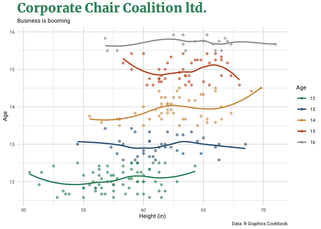
We now have the colors and theme built so now we can see our brand new corporate visualization using data from the gcookbook package.
heightweight.5<-filter(heightweight,ageYear<=16)

ggplot(heightweight.5,aes(heightIn,ageYear, color = factor(round(ageYear)))) +
  geom_point(alpha=.6) +
  geom_smooth(se=FALSE) +
  scale_color_manual(values=corporate_colors) +
  corp_theme() +
  labs(title='Corporate Chair Coalition ltd.',
    subtitle='Business is booming',
    color='Age',
    x='Height (in)',
    y='Age',
caption='Data: R Graphics Cookbook') 
There we are! A simple recipe to build your own custom plot theme which can be easily replicated more multiple clients, projects or whatever the need may be. To some of you this might be a little too much work for you and want one theme you can rely on and would like a suggestion of an out of the box theme ready to use. For that I would suggest looking into theme_ipsum from the hrbrthemes package by Bob Rudis. This is a well maintained and very thoughtful look into creating a theme that looks great but has a myriad of functions for you to use.