If you are exposed to any media or news coverage around this season of the Premier League you will undoubtedly hear the term ‘xG’ or expected goals. Pundits use it, some announcers laugh at it and it is everywhere on Twitter or Reddit when it comes to discussing the outcome of games so what is it? Many people who are more eloquent than me have written about it so I will let you do the research on that and here are a couple links to help!
- Goal.com: What is xG?
- Wikipedia: Expected Goals
So why xG? Why now? Well I have felt as though my website has fallen by the wayside recently and I wanted to pick up a small easy project to remind myself of the joy looking into different data brings me and hopefully get back into some semi-regular posting. That is where the understatr package comes in. I have had my eye on this for a little while and finally told myself I would open it up and give it a whirl.
library(tidyverse)
library(awtools)
library(understatr)
library(engsoccerdata)
library(ggforce)
library(ggrepel)
Once these packages are loaded we can use understatr to get game data by team for the current Premier League season and since I play fantasy football I can’t help but think of the data in terms of game weeks so I create a week variable as well.
#build points
leagues <- get_leagues_meta() %>%
  filter(league_name == 'EPL')

team_data <- map_dfr(unique(leagues$league_name), get_league_teams_stats, year=2021)

team_data <- team_data %>%
  arrange(date) %>%
  group_by(team_name) %>%
  mutate(week=row_number())
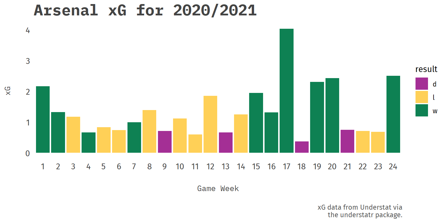
Now that we have this data let’s take a look at Arsenal’s data so far this season for context. We can just do a simple bar chart looking at their expected goals (xG) by week and result.
team_data %>%
  filter(team_name == 'Arsenal') %>%
ggplot(aes(x=factor(week),
           y=xG,
           fill=result))+
  geom_bar(stat='identity', alpha=.95) +
  a_secondary_fill() +
  a_plex_theme(grid = FALSE,
               base_family = 'Fira Sans',
               base_size = 11) +
  labs(title='Arsenal xG for 2020/2021',
       x='Game Week',
       y='xG',
       caption='xG data from Understat via\nthe understatr package.')
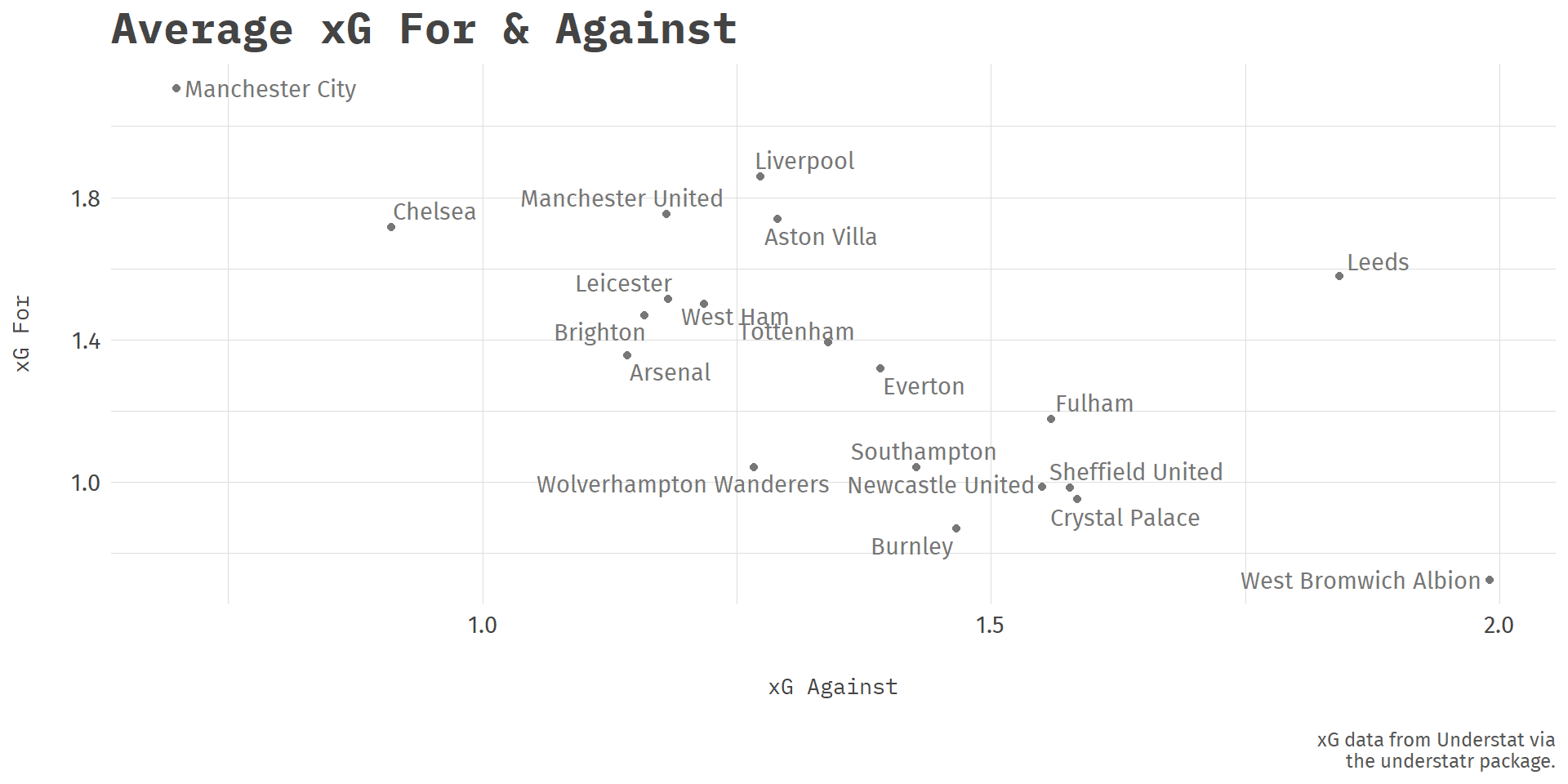
This data is interesting but my intent with this exercise is to give me some more context to how teams overall are playing this year not necessarily by week. Luckily we now have not only xG for each team but also the xG of the opposition as well which will be interesting to examine together for the teams thus far this season. To start we just need to group by team and then get the mean xG for and against the team for the season.
#team averages plot
team_summary <- team_data %>%
  group_by(team_name) %>%
  summarize(avg_xg = mean(xG),
            avg_xga = mean(xGA)) %>%
  ungroup()

#plot with image
ggplot(team_summary,aes(x=avg_xga, y=avg_xg)) +
  geom_point(color='#777777',
             size =1.5) +
  geom_text_repel(aes(label=team_name),
                   fill=NA,
                   family='Fira Sans',
                  color='#777777') +
  a_plex_theme(base_family = 'Fira Sans',
               base_size = 11) +
  labs(title='Average xG For & Against',
       x='xG Against',
       y='xG For',
       caption='xG data from Understat via\nthe understatr package.')
This plot is fairly plain. We can see some outliers like Leeds but there has to be other information we could inject to help interpret what these results mean. I think what would be interesting with this information to see the context of where they are in the league currently and for that I will use the trusty engsoccerdata which finds its way into all my football related adventures.
Using the maketable function with the provided england_current function we can grab the current premier league table to get the team positions. To bring the two together we need to do a little massaging to a couple shortened team names but luckily the case_when function helps us there. Then finally I think instead of distinct position we can group the teams by a further groups made up of champions league places, relegation and top and bottom halves.
current <- maketable(df=england_current(),
                     Season = 2020,
                     tier = 1,
                     pts = 3) %>%
  mutate(team_name = case_when(team == 'Leicester City' ~ 'Leicester',
                               team == 'Leeds United' ~ 'Leeds',
                               team == 'Brighton & Hove Albion' ~ 'Brighton',
                               team == 'Tottenham Hotspur' ~ 'Tottenham',
                               team == 'West Ham United' ~ 'West Ham',
                               TRUE ~ team),
         Pos=as.numeric(Pos))

team_summary_tbl <- team_summary %>%
  left_join(.,current) %>%
  mutate(grp = case_when(Pos %in% 1:4 ~ 'Top 4',
                         Pos %in% 4:10 ~ 'Top Half',
                         Pos %in% 11:17 ~ 'Botton Half',
                         Pos %in% 18:20 ~ 'Relegation'))
Bringing the pieces together
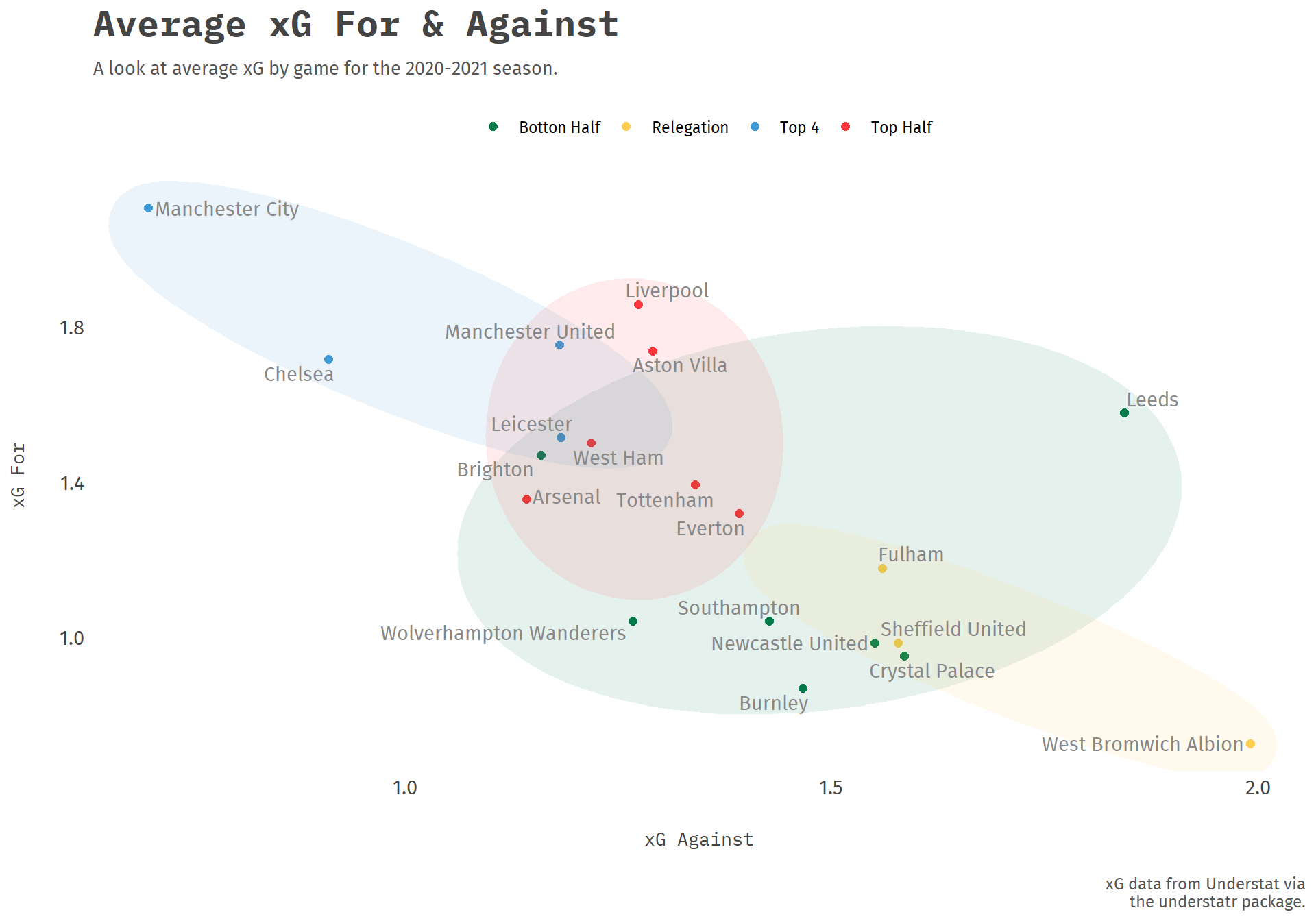
Finally we are ready to plot. As you might have noticed at the beginning we called two packages I haven’t mentioned yet which are ggrepel and ggforce which will help us create the final chart. Now that we have the groups made I think we can take the original plot that was fairly plain and add some zest. Using geom_text_repel and geom_mark_ellipse we can show the general area the teams occupy to see what teams see to be operating inside or (more importantly) outside their current position in the table. Let’s give it a try.
ggplot(team_summary_tbl,aes(x=avg_xga, y=avg_xg)) +
  geom_point(aes(color=grp),
             size = 2) +
  geom_mark_ellipse(aes(fill = grp),
                    alpha=.1,
                    color=NA,
                    show.legend = FALSE) +
  geom_text_repel(aes(label=team_name),
                  family='Fira Sans',
                  color='#888888') +
  a_flat_color() +
  a_flat_fill() +
  a_plex_theme(grid = FALSE,
               base_family = 'Fira Sans',
               base_size = 11) +
  theme(legend.position = 'top') +
  labs(title='Average xG For & Against',
       subtitle= 'A look at average xG by game for the 2020-2021 season.',
       x='xG Against',
       y='xG For',
       caption='xG data from Understat via\nthe understatr package.',
       color='\n')
I originally wanted to call this plot (and maybe this whole post) the average Joses in reference to Tottenham but the real interesting point might lie in Brighton’s xG stats. Their results have landed them in the bottom half and actually 15th at the time of posting which is just 8 points above relegation but their xG position has them up towards teams who are in the top half or even the top 4.
Though fairly straightforward this was exactly what I was hoping to achieve and as far as exercises go this was a lot of fun and hopefully will snowball into some more projects as more free time comes around. Thanks for taking a look!